In our last blog, we looked at Trend Forecasting and some nifty new technology being used to predict and influence colour trends in the world of design. Pantone’s unique partnership with trend-tech company Heuritech will allow designers, manufacturers and retailers to respond to consumer demand much more quickly thanks to the gathering of intelligence via social media. Heuritech’s AI algorithm uses social media feeds to identify emerging colour trends and other styles being shared via platforms such as Instagram and Pinterest.
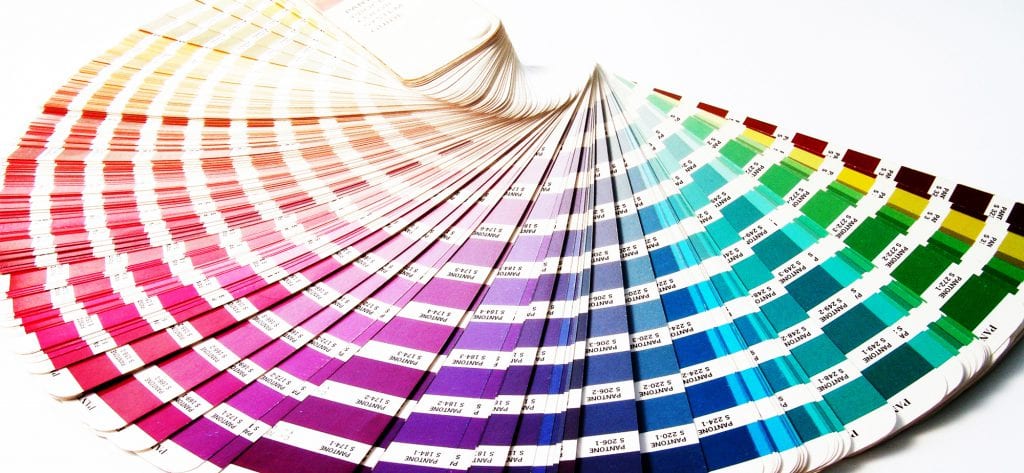
As part of the partnership announcement, Pantone presented their Autumn/Winter colour report. All of these colour trends have been identified using Heuritech’s platform rather than traditional trend forecasting methods. Some of these colours might be what you expect for the time of year but there are a few surprises too!
Here are Pantone’s top colour trends for Autumn/Winter 20-21.
Mint Palette
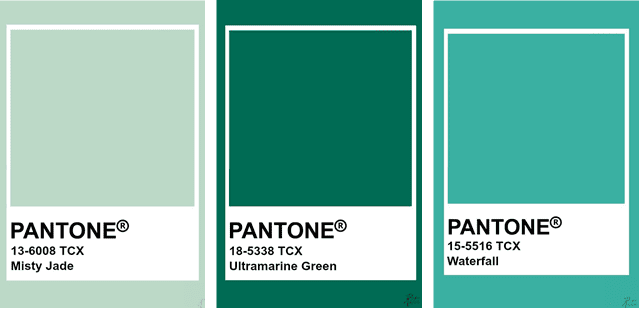
It is seemingly impossible to discuss anything at the moment without mentioning Covid-19, and there are no exceptions here. Unsurprisingly, with its links to nature, green has been one of the most popular colour trends of 2020. Natural colours have a calming effect, and with the encouragement of authorities to spend more time outside, it is only natural that we might lean towards this palette.

Some of you may think that this palette is reminiscent of WGSN’s 2020 Colour of the Year Neo Mint. Misty Jade is also very similar to the Dulux Colour of the Year for 2020, Tranquil Dawn. It may seem as though this prediction is old hat, yet as we explored last week, trends are now set in a more organic way, rather than dictated.
Just one scroll through Pinterest tells you that we are looking more to nature when choosing colour schemes for our homes. We’ve spent more time outside than ever before and even as the weather in the western hemisphere changes and the central heating goes on, we’ll want to still feel the benefits of nature inside our homes.
Pantone’s Mint Palette will bring fresh positivity into any space. In the latter part of 2020, these cool and fresh greens will be paired with natural materials. Complimentary themes such as rattan and decorating with houseplants are also set to continue into 2021.
Pastel Palette
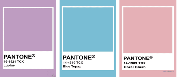
Not your average warm and fuzzy winter palette, this was the surprise reveal. Pantone and Heuritech attribute this colour trend with our need to regress to the comfort of childhood in these difficult times.
The Pastel Palette features shades of purple, blue and pink which are reminiscent of children’s sweets, ice cream parlours and unicorns. We’re not saying that you should all decorate your home like a five-year old’s birthday party but used sensitively, these pastel hues will add a safe and welcoming feel. Paired with stark white or darker shades of the same colour, the pastel colour trend will invigorate any room.

Earthy Tone Palette
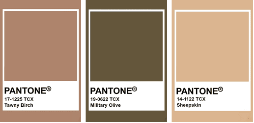
Synonymous with Autumn and Winter the earthy tones of this palette are not a surprising colour trend for this time of the year. As the leaves start to turn, we start to look for those colours which add comfort and warmth to our homes.
This is another trend to which the current pandemic is being linked as it keeps us close to nature. Most years, in September, you’ll start to see autumnal shades across fashion, interiors and other design disciplines but this year the predicted shades are more modern and tranquil, rather than bright and dominant.
Use these shades as accent colours in a neutral scheme as they are then easy to rework come the Spring. Homewares retailers will be full of warm and cosy textiles so bedding, blankets and other soft furnishings are a cost-effective way of working this trend on a budget.

Blue Tone Palette
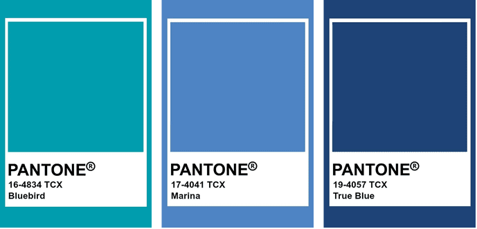
Finally, this is the trend being shared most by influencers on social media. Perhaps you’ve noticed the flashes of kingfisher blue, indigo or sky blue out there in your feed?
The calming influences of blue can create a different quiet confidence in a scheme. A confidence that comes from safety and stability. Again, the trend is closely linked to the global pandemic where security is linked to cleanliness and healthcare, including mental health.
You’ll also notice that these colours have names linked to nature – birdlife, water-related names which, with their bright and cheerful nature, inspire and comfort us.
Again, use the blue palette as an accent colour against crisp white or be bold and creative and use one solid colour with confidence.
You can learn more about using colour with confidence here in our ‘Getting Started with Colour in Interior Design’ blog.

Next Week's Blog...
We have an exciting announcement in our blog next week as we exclusively reveal the Dulux Colour of the Year for 2021! Last year’s colour, Tranquil Dawn, set the perfect calming backdrop for what has been a troubling year.
Some of the world’s top designers gathered at Akzo Nobel HQ to predict the colour trends set to dominate the next 12 months, with one which would set the scene for the recovery to come in the next 12 months. But what will it be? Keep your eyes peeled to find out!


One Response
Your blog post was thought-provoking and well-articulated. I enjoyed the unique perspective you brought to the topic and the thoughtfulness with which you addressed different angles.