Denim Drift has been chosen as the Dulux colour of the Year 2017 and selected by a team of global experts to follow on from the 2016’s Colour of the Year ‘Cherished Gold’.
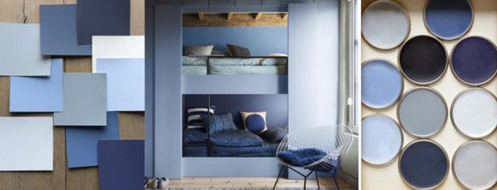
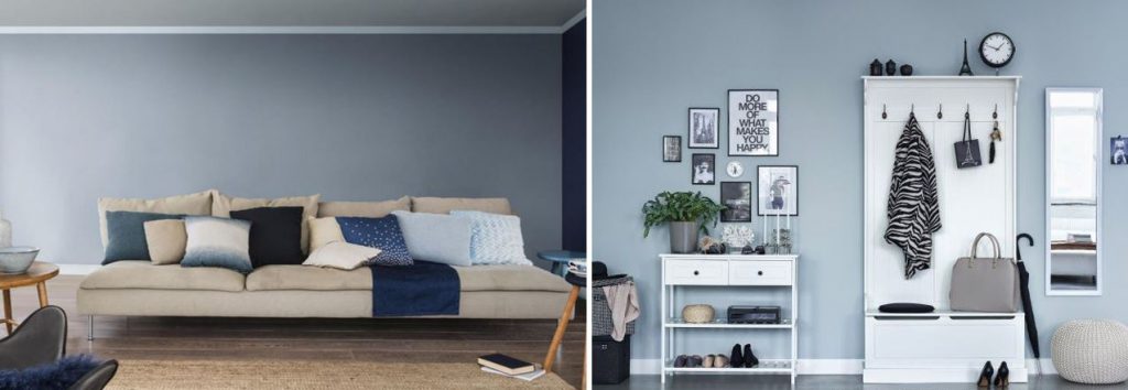
Its versatile, neutral tone allows the successful implementation of various different textures, colours and materials to accompany your Interior schemes.
“When it comes to accessorising and furniture, introduce neutrals and natural woods, but choose accessories in the blues family to keep the restful mood” (Dulux, 2017)
Denim Drift is part of a group of 10 different blue tone colours that all complement one another; Earl Blue, Woad Walk, Cobalt Night, Marine Waters, Cornflower Bunch, Clock Face, Sash Blue, Indigo Shade and Borrowed Blue.
Marianne Shillingford the Creative Director at Dulux and one of our previous Interior Design Tutors here at the National Design Academy (NDA) states the following:
“Creating a blue colour scheme is successful when you choose shades that work beautifully together. This year the Colour of the Year, Denim Drift, has been teamed with a palette of blues which give you the confidence to get it right every time.”
At the National Design Academy, we think it is a great colour selection that can be used across different designs. What do you think of the Denim Drift colour?
References:
https://www.dulux.co.uk/en/articles/colour-of-the-year-2017?gclid=CNecgY-vlNICFaKw7QodP7YOLg
https://uk.pinterest.com/sapereDIcasa/denim-drift-colore-2017/

5 responses
I am satisfied with your site and your posts they very nice and very useful to us. I got such a good information on this topic it’s very interesting one Thanks for sharing the best posts they amazing. you made a good site it very helps us.
Denim Drift colour are looking great what type of Denim Drift colour combination are best for Living room?
Hi Sasha, thank you for your comment. To suggest specific colour combinations, this could be difficult as choosing the right colour for your space will depend on a lot of factors, such as orientation, level of natural light, and size of the room. If you have a good sized room, with a good amount of natural light, you could go for a blue which is quite deep. If you have lots of natural light, a paler blue will make the room feel colder/cooler. Choice of colour also comes down to personal taste, too, which is important when choosing the right colour for your environment. The National Design Academy
Thank you for sharing this great information. In this post give good explanation that helpful and useful for people It’s wonderful information. I like this post. Thank you for sharing this with us.
Amazing! It is the epitome of creativity and style. It looks so cool and inviting that anyone would want to live in a home like this. I wouldn’t have in my wildest imagination thought of doing a blue paint and that too the one that will look so good.