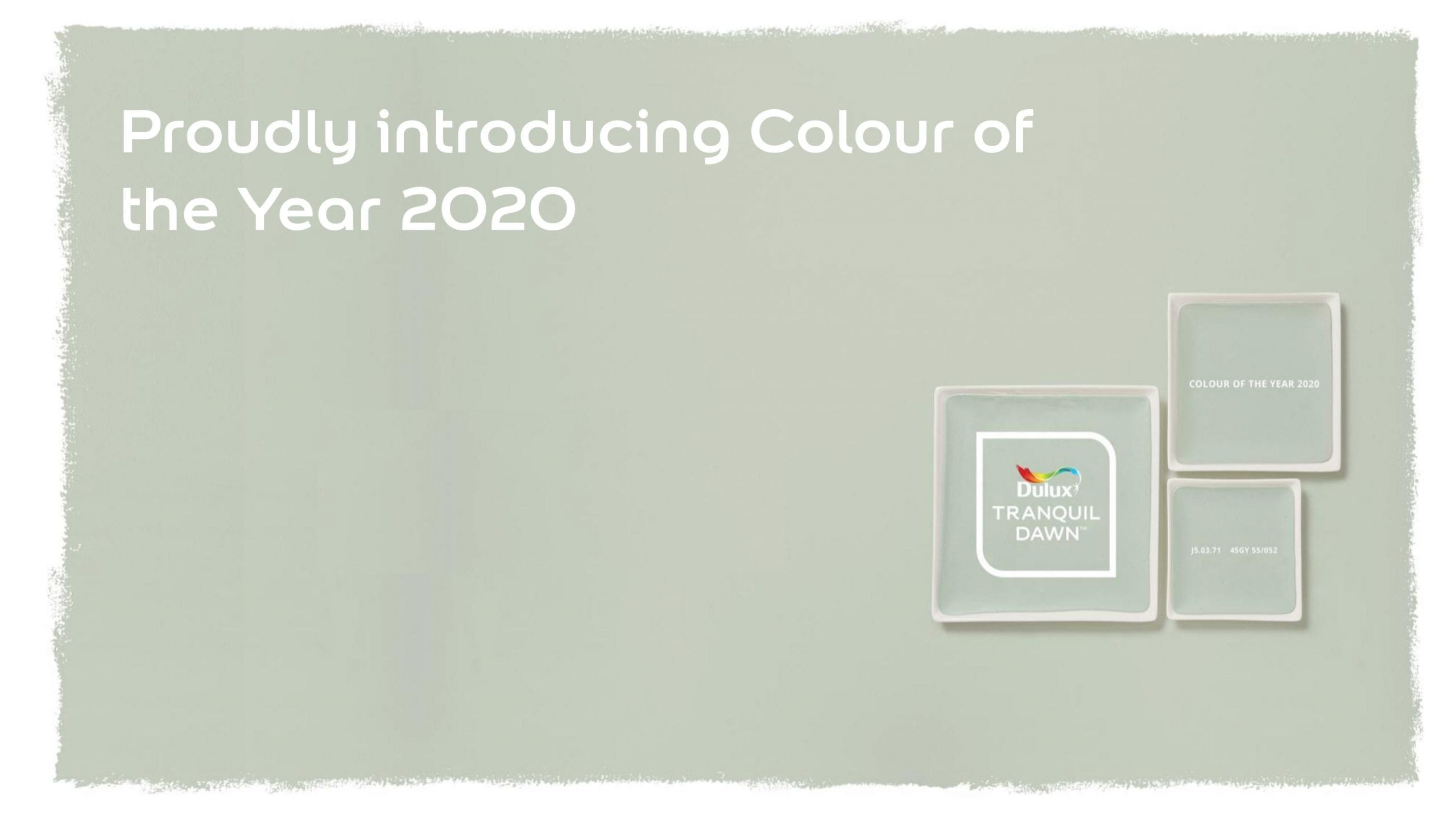
It is so exciting to finally reveal to everyone, Dulux’s Colour of the Year 2020. With information exclusively provided by Marianne Shillingford, Creative Director of Dulux and a great friend to the NDA, we’re going to explain not only the ideas behind Tranquil Dawn, but the first of it’s associating palettes. These four palettes showcase various and captivating ways that Tranquil Dawn can be used in your home, and what message each colour combination represents. The first one will be explained here and the other will be explored later in the year. We can’t wait for you to learn about them! But starting at the beginning, the main attraction. Tranquil Dawn!
Bringing a specialist team of experts from a variety of countries to Amsterdam, Dulux gathered their opinions on what they thought the future of colour was. What did 2020 mean for the design industry? What did it symbolise? Collectively, they recognised the importance of first looking back. 2019 was the year of activism, coming out of our cocoon and opening our eyes to the world around us. We truly believed that we could make a difference. There was a new sense of optimism, we were ready for change! Hence, Spiced Honey was born and it’s varying palettes recognised the emotions of the year.
This year, Dulux’s trend forecasting experts commented on the world’s reliance on digitalisation. The rise of robotics, AI, virtual reality and ever-updating mobile phones means we are slowly disconnecting from real life. We are lacking a genuine connection with people, not getting enough sleep and not practising self-care. However, there is a growing movement against this! Many people are putting great value on health, with the rise in veganism a great example of this. Handmade products, customisation and an emphasis on finding meaning in reality over a virtual world. More and more, we are valuing experiences of calm. Serenity. Tranquillity.
2020 symbolises not only a new year but a brand new decade. A brand new dawn! The yearning for change from 2019 is not going anywhere, but moving forward, we are looking at the world with a new perspective of hope. We are believing in each other and our power to change things for good.
What does all of this mean for us? This all means that we are trying to understand our place in society and how we can make a positive impact. We want to find balance and structure, to be architects of our own future. We need to look after ourselves.
The Theme of 2020: What Makes Us Human?
THE WANT TO CARE, TO BE PLAYFUL, THE NEED FOR MEANING AND THE URGE TO BE CREATIVE

And now, drum roll… The first Tranquil Dawn palette. The Meaning Palette!


Inspired by a cold and slow Winter’s dawn, The Meaning Palette is a cool-toned colour combination representing our need to find meaning in life. To slow down, take everything in and look for our life purpose.


It’s been so exciting working with Marianne and Dulux on this reveal. But what do our tutors think of the Colour of the Year, 2020?
Vicky McClymont, Senior Interior Design Tutor: “The Dulux Colour of the Year 2020 encourages us to embrace a new dawn; a forward-thinking palette reflective of a need for fresh purpose and new perspectives. ‘Tranquil Dawn’ is also well-positioned to be a colour popular within the heritage interiors market, emulating palettes widely associated with late Georgian and Regency interiors. Fresh purpose and a new lease of life are central to this year’s theme; a narrative which will carry well through the regeneration of our heritage environment”.
Simone Haley, Senior Interior Design Tutor: “Tranquil Dawn is the visual definition of feeling cool, calm and collected. This crisp, subtle, yet intriguing colour is suited for most colour schemes and works well as a backdrop and in the foreground. Different schemes and settings highlight the different qualities of this colour, this muted neutral green is extremely versatile. Any measure of colour brings a positive lightness, a sense of balance and a refreshing appeal to any space or design.”
Gill, Garden Design Tutor: “Dulux’ Tranquil Dawn will translate well to the outdoors when quietly combined with white and pale blue planting themes and softly textured grasses. It will also serve as a neutral against which to make colours pop, either in the border or in accessories.”
Stephen, Interior Design Tutor: “Tranquil Dawn feels like a colour that could work with a heritage scheme, it reminds me of a Robert Adam Green, something quite restful and calming, which brings to mind the interiors of the neoclassical period.”
Ruth, Interior Design Tutor: “Tranquil Dawn has a great transition between pastel and earth tones – and the shade seems to change each time you look – depending on how it is presented. Grey, blue, green… The paint in person would surely react to light in the same way, which makes it perfect for an ever-changing interior where there are multiple light levels through the day.”
Two even more exciting things are coming! The next three palettes will be explained throughout the year and into 2020. We cant wait to tell you all about them. Also, we have a brilliant opportunity for our students and students of other institutions to get involved. You DON’T want to miss that announcement – watch this space!
What do you think of Tranquil Dawn? Were you surprised?

2 responses
Hi!
I am very happy to read about careful color selection!
Thank you!
Personally, I love ‘Tranquil Dawn’, and completely agree that politically and socially things need to be taken down a notch. Tranquil Dawn, in my humble opinion, offers stability, calm and collectedness. It’s a beautiful peaceful colour which I feel society has been calling out for for a long time. Being a muted green, I feel it offers a sense of healing the heart, which for a lot of people, life has been hurting too much due to all the stresses and strains of trying to keep up with seemingly impulsive changes and high productivity.
I think Dulux have pinpointed what people need beautifully.