Written by NDA senior tutor, Vicky McClymont
In this series of blogs, we will be taking a closer look at one of the most important topics in interior design; colour theory. In the fourth volume of this series, we take a look at one of the most popular and versatile colours to use in interiors; blue.
Vol.4 – Blue
Blue has a quality of cool expansiveness and openness. It has a relaxing and seductive effect and can encourage isolation, solitude and reflection. It is said that blue can lower blood pressure as it affects us mentally rather than physically. Blue is associated with a sense of formality, though the mid-blues also have a playful quality about them. Because of its association with water, blue is a popular colour for kitchens and bathrooms. Strong blues stimulate clear thought, whereas soft blues calm the mind. Blue is the colour of clear communication, although on the flip-side, it can also be seen as cold and unemotional.
Colours also bring to mind certain word associations, which also help determine the use of the colour:
POSITIVE: Intellectual, Reserved, Efficient, Calm, Soothing, Serenity, Trust
NEGATIVE: Bold, Heavy, Withdrawn, Unfriendly, Cold
Blue in Interiors
The use of blue in interiors is timeless. If we think about the colour blue as a current trend, it is difficult to think back when it wasn’t in style; this is the beauty of blue. It is such an adaptable colour and with careful selection, will suit any space.
Historically, the first signs of the use of blue can be traced back 6,000 years. Derived from the semiprecious stone, Lapis, the Egyptians were the first culture to generate their own blue pigments based on the highly-prized stone. Mixed with calcium or limestone, the lapis generated a number of pigments, all of different saturations. The colour was, however, incredibly expensive and therefore reserved for royalty; this is also a primary reason for why the colour was so rare for a number of years.
When we think of the formal use of blue in interiors, the Georgian era became synonymous for its use, noting the changes in tone and shade throughout the Early, Mid, and Late (Regency) periods. In Early Georgian interiors, muted tones were common, such as blue-grey. As the Georgian period progressed through its monachs, so did the intensity of colour tone. As we can see from the images below, the muted blue-grey tone of the Statue Gallery in Holkham Hall, 1734, (left) is very different to that of the Blue Velvet Room found in Chiswick House, 1788, (right), with the blue State Bedroom at Kedleston Hall, 1765, (middle) bridging the two.
 Top-Bottom: The Statue Gallery at Holkham Hall; The Blue State Bedroom at Kedleston Hall; The Blue Velvet Room at Chiswick House
Within contemporary interiors, blue is a popular choice for many rooms, but is still a colour predominantly used in kitchens and bathrooms. The versaility of the numerous tones and shades is part of its brilliance, but the key to its correct use lies within a combination of pairing the correct tone/shade with the room use and an understanding of the amount of natural light that enters the space.
As we can see below, deep, rich and warm tonal blues are common of many contemporary kitchen and bathroom spaces, and pair well with contemporary fittings and fixtures, such as brass, matte black and an array of woods.
 Deep and rich blue tones are common in many contamporary kitchen spaces, which support the clean lines of quartz countertops and streamlined door finishes.
 An array of blue tones noted within these bathroom examples, bringing textre and reflection of light in a myriad of spaces. Whether choosing contemporary or more tranditional fittings and fixtures, blue works well as a colour choice.
Break the rules with blue
As the saying goes, “rules are made to be broken” and this is certainly the case with colour theory. The definition of a “theory” is that it is a “system of ideas intended to explain something, especially one based on general principles”. The term general, is one which can be applied here. Colour theory is a general principle which many designers refer to, but it does not mean that designers have to rigidly stick to these general ideas.
Below, we showcase some of those interiors which “break the rules” and defy the general principles of colour theory; a reflection of how the negative associations of a colour can, with careful application, can instead create a welcoming and relaxing space.
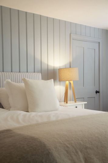
Using pale or pastel shades of blue can often bring a sense of coldness to a space, which is something to steer away from particularly in a bedroom. Here, these examples show successful applications of cooler shades of blue, but still manage to exude a sense of calm and warmth. Pairing cooler shades of blue with warm woods, deeper tones to build up a monochromatic palette, an ombre mural to balance white tones, or to add some simple panelling to create depth, texture and interest will help to create a warm and welcoming atmosphere in any space.
 As seen in contemporary kitchen and bathroom trends, using deep, rich and warm tones of blue also work really well in bedroom spaces, creating an almost ‘cocoon-like’ atmosphere, exuding a sense of serenity and warmth. Even in smaller spaces, deep, rich tones of blue work well if being paired with dusky pink highlights or brass/copper fittings and fixtures.
As we can see through the selection of images, blue, in its cooler shades and tones, can create a sophisticated, warm and welcoming space. Used in any room, blue evidences its adaptability and versatility when best paired with supporting fittings, finishes and accessories that bring out the quality and depth of tone.
Keep posted for our next instalment of ‘The Art of Colour Theory’ blogs – coming soon!

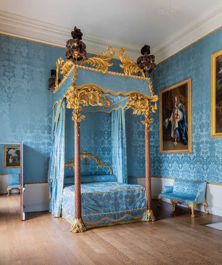
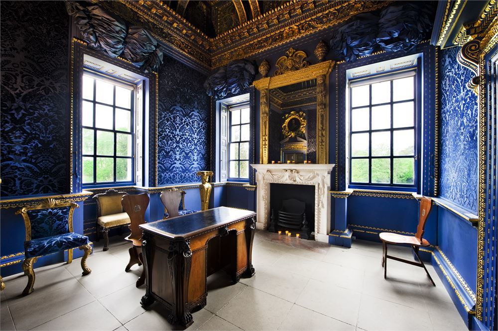 Top-Bottom: The Statue Gallery at Holkham Hall; The Blue State Bedroom at Kedleston Hall; The Blue Velvet Room at Chiswick House
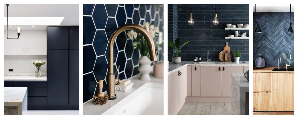 Deep and rich blue tones are common in many contamporary kitchen spaces, which support the clean lines of quartz countertops and streamlined door finishes.
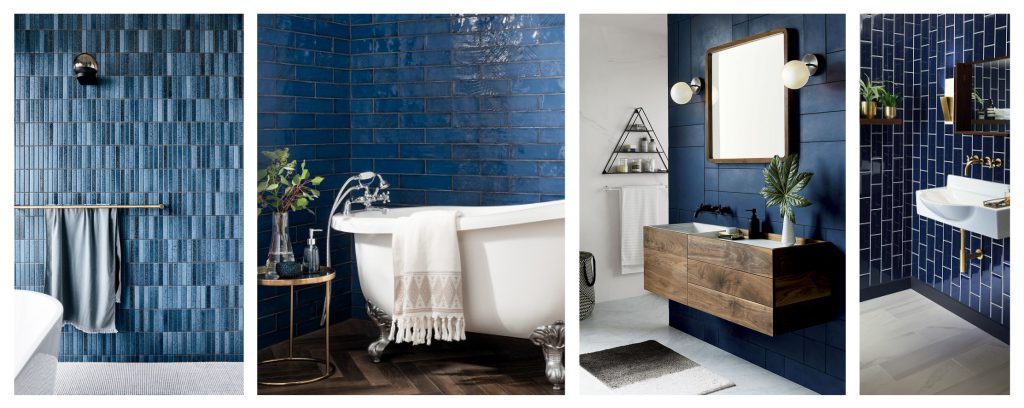 An array of blue tones noted within these bathroom examples, bringing textre and reflection of light in a myriad of spaces. Whether choosing contemporary or more tranditional fittings and fixtures, blue works well as a colour choice.
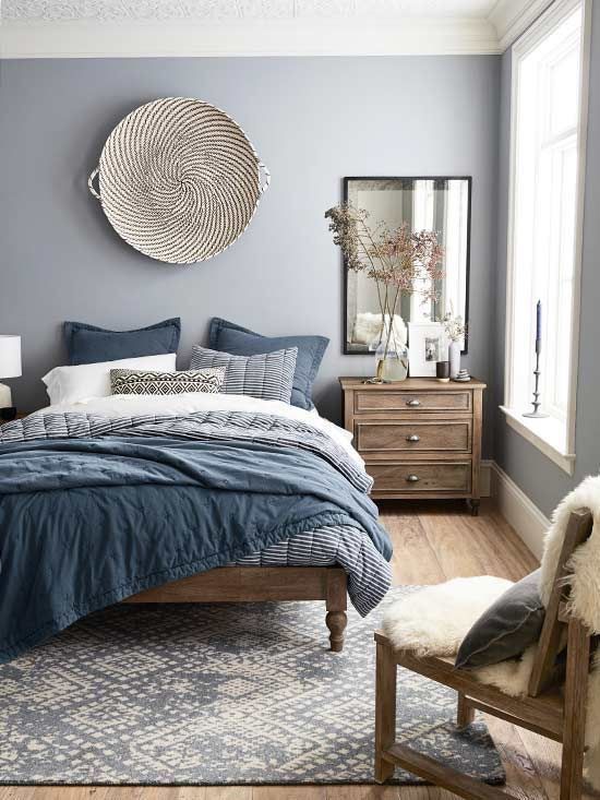
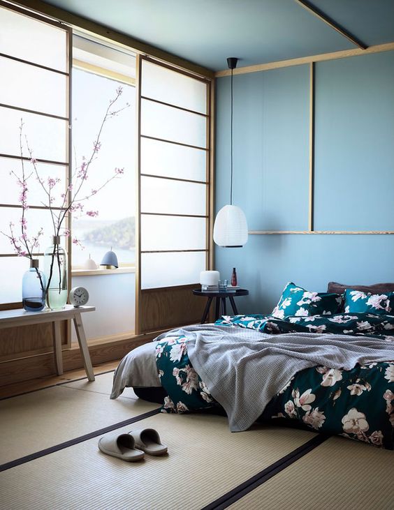
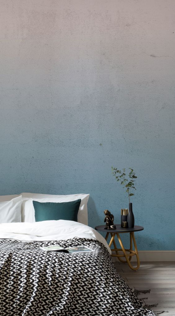
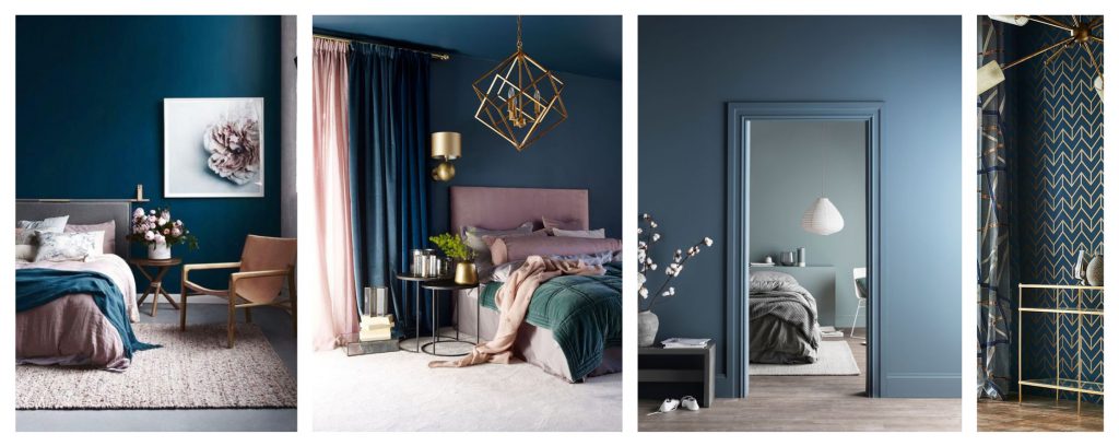 As seen in contemporary kitchen and bathroom trends, using deep, rich and warm tones of blue also work really well in bedroom spaces, creating an almost ‘cocoon-like’ atmosphere, exuding a sense of serenity and warmth. Even in smaller spaces, deep, rich tones of blue work well if being paired with dusky pink highlights or brass/copper fittings and fixtures.

4 responses
Very interesting and useful Blog.
I also would like to add, Before Pharos, Babylonian Empire (18th to 6th centuries BC.) has selected the color Blue to be on their famous empire Gate ” ISHTAR” (the Gate of God of Beauty).
Very nice and really nteresting for even beginers
Blue can definitely be dreamy. When I think of a night sky I think of a deep blue hue- making this perfect for bedrooms for example. Great post and glad that it was mentioned that colour theory is meant to serve as a guide and not as a rigid rule to abide by. Thank you for sharing xx
This was an interesting one, never thought that blue wouldn’t be good for the bedroom but it makes sense since like said above it’s a cool tone in a room fit for warmth.