Our Top Tones for Spring 2025

Spring is finally here, and with it comes the perfect opportunity to finally refresh your home with a much-needed burst of colour! As the days grow longer and nature awakens, it’s time to breathe new life into your interiors. Whether you’re aiming for a serene escape or an energetic, lively vibe, the right colour schemes this season can completely change the feel of your space.

Our expert tutors have shared their top spring colour picks that will inspire you to embrace the season’s beauty and create a home that feels as fresh and vibrant as the world outside. Ready to get started? Let’s dive into the colours that will make your space shine this spring!

Look at nature for inspiration

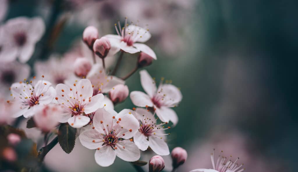
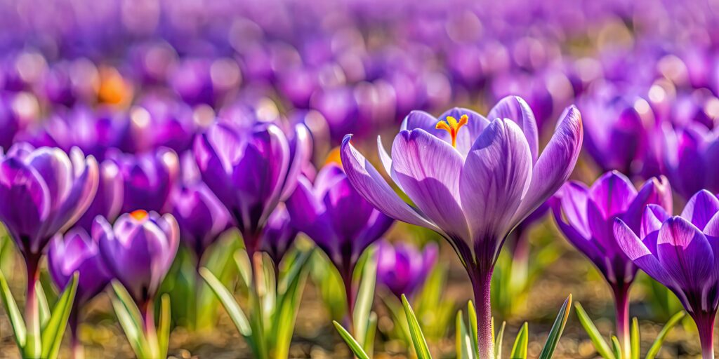
With blooming flowers, fresh greenery, and (hopefully) blue skies, Spring is a feast for the eyes, with nature offering a stunning array of colours to inspire your home’s palette. Colours can be taken from natural elements such as

  • Fresh greens that bring to mind new growth 
  • The soft pinks and whites of blooming trees 
Closeup of spring blossom flower on dark bokeh background.
Pastel pink and white tree blossoms bring a fresh, romantic feel to spring interiors
  • Bright blues that signal the return of sunny days 
  • Cheerful yellows that remind us of daffodils and primroses 
  • The delicate lilacs of crocuses and other spring flowers
     

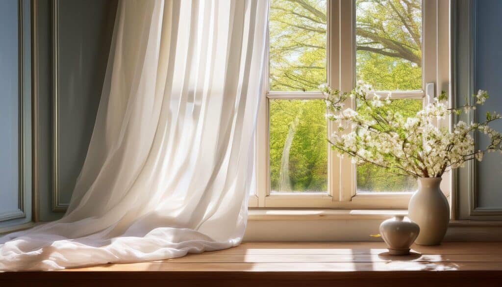
Taking cues from nature can instantly give your space a light and airy feel, perfect for welcoming the season. 

Purple crocus flower in bloom in the field before harvest, saffron, spice, purple, petals, plant, nature, agriculture, harvest
lilac-hued crocuses add a gentle pop of colour, perfect for a spring palette

Opt for Light & Airy Shades

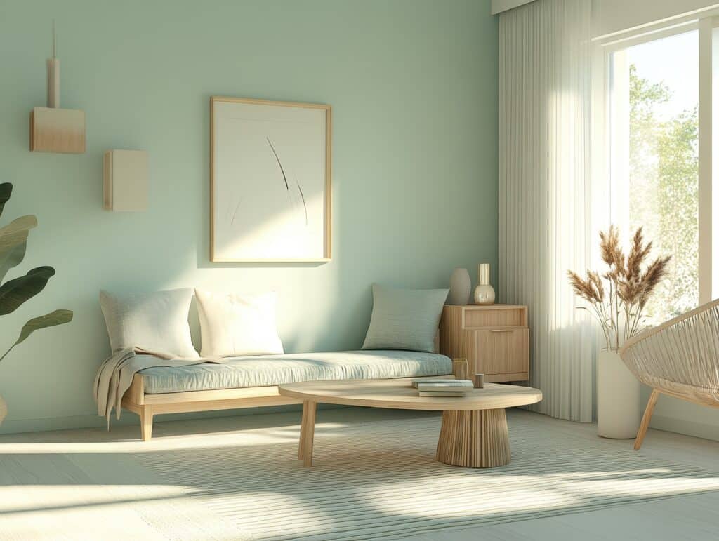
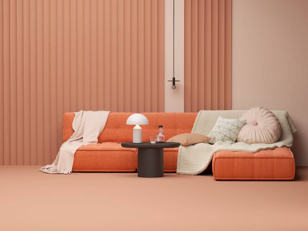
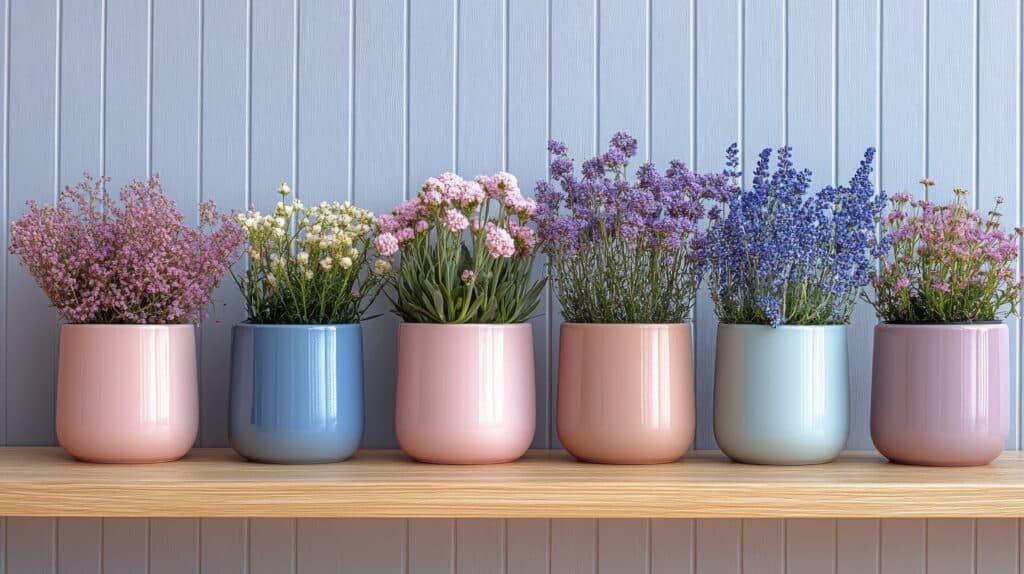
Spring colours are all about soft, welcoming tones that make your space feel open and fresh. Instead of opting for deep, heavy shades, try these lighter alternatives: 

  • Mint instead of forest green 
  • Coral instead of darker reds 
  • Peach instead of burnt orange 

These gentle pastels are perfect for walls, textiles, or accents, creating an easy, seasonal update to your space.

Embrace the simplicity and charm of Scandinavian design in this coral living room.
coral adds warmth and vibrancy without the intensity of deep red, perfect for a fresh spring look

Creating a Balanced Palette

A great colour palette isn’t just about picking your favourite shades, it’s about finding balance. To create a balanced palette, think about mixing the following:

  • Neutrals: Soft beige, light grey, or creamy whites provide a calming foundation.
A modern living room interior with light neutral color scheme
Soft beige, light grey, or creamy whites provide a calming foundation
  • Main Colours: Pastels and subtle brights inject personality and warmth into the space.
  • Accents: A pop of a slightly bolder colour can be used to highlight or accentuate features.
Chic living room setup for a young adult, incorporating a blend of bold and pastel colors, sleek furniture, and personalized decorative elements to create a unique space
A pop of a slightly bolder colour can be used to highlight or accentuate features

Think about mood & occasion

Your choice of colours can completely set the mood in a room. Here’s how to match your palette with the atmosphere you want to create: 

  • Casual & Fresh: Light pastels like baby blue and blush pink create a chilled, breezy feel.
  • Vibrant & Playful: Think lemon yellow, coral, and turquoise for an energetic, fun vibe.
  • Elegant & Subtle: Lavender, muted sage, and soft blue add a sophisticated, calming touch. 
3d rendering of an 80s vibrant interior in Memphis design style with red, yellow mint and pink colours, a ficus lyrata and a velvet lounge chair
Blush pink brings a fresh, inviting touch to any spring space, perfect for a light and airy feel

Spring 2025 Colour Trends

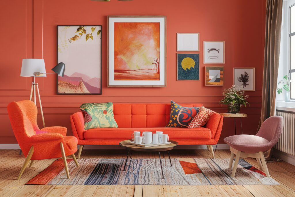
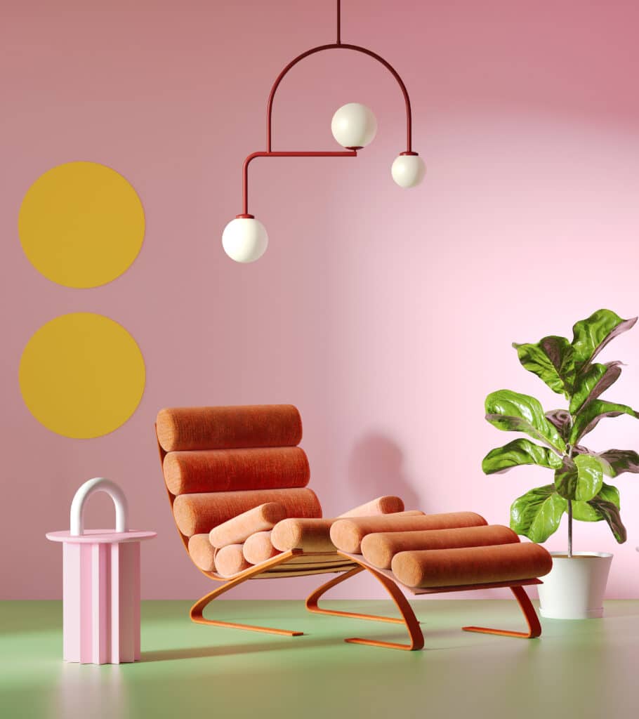
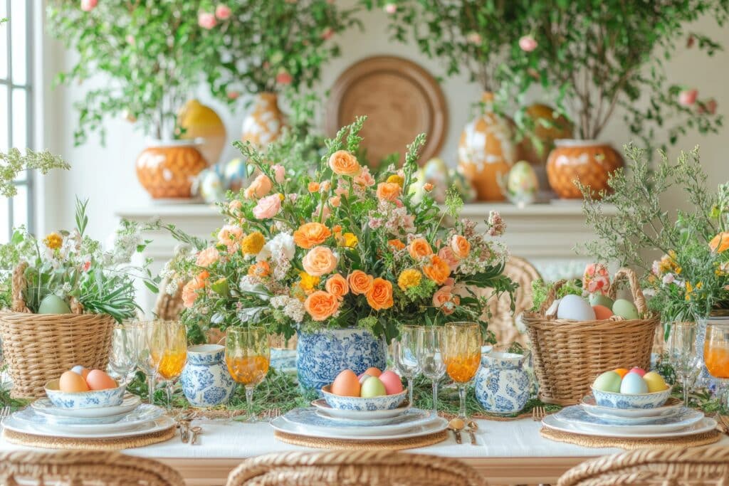
This season, we’re seeing a combination of deep tones like reds, blues, and greens paired with soft pastels. Apricot is predicted to be the standout colour of Spring 2025, with stripes are set to make a big return being the pattern of choice. These trends are all about blending bold and soft colours for a fresh, modern look that still feels timeless.

Tone collection
Apricot is set to be a key colour this year, with stripes as the pattern of choice

How to Update Your Colour Palette for Spring

Let’s be honest, you don’t need a full renovation to bring spring colours into your home. But even small changes can make a HUGE impact! Here are a few simple ways to refresh your space without necessarily breaking the bank:

Switch out your soft furnishings

  • Swap out heavy, dark throw pillows and blankets for lighter, pastel ones.
  • Bring in a fresh, light-coloured rug or one with a floral pattern to brighten up the room. 
A wooden bench under a blooming tree, decorated with floral cushions and a throw blanket
Swap dark, heavy throws and pillows for soft pastels to embrace the light, airy feel of spring.
  • Try sheer or linen curtains instead of thick, dark ones.
a window with sheer white curtains gently billowing in the spring breeze maintain a soft and muted color scheme to convey a sense of tranquility and simplicity
Sheer or linen curtains in soft hues create an airy, refreshing spring feel

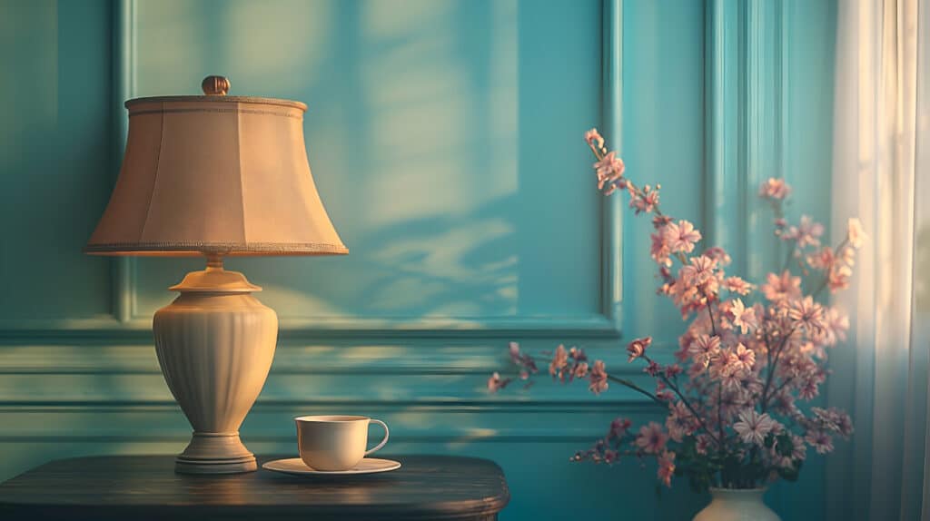
Refresh walls & artwork

  • Paint an accent wall in soft shades like pale blue, peach, or mint.
  • Switch out winter-themed art for prints inspired by flowers and nature. 
Coral or terracotta living room accent sectional sofa. The walls are dark beige. great art gallery location. Colorful house interior mockup.
Replace dark, wintery art with floral, nature-inspired, or pastel abstract prints for a touch of spring.

Bring in fresh accessories

  • Incorporate pastel-coloured vases and candles into your decor. 
  • Swap out dark dinnerware for lighter, floral-themed pieces. 
  • Use pastel planters for houseplants like ferns or lavender to keep things fresh. 
Easter table setting decorated with colorful eggs, flowers, and greenery
Opt for vases and candles in soft pastels, glass, or ceramic for a fresh spring touch

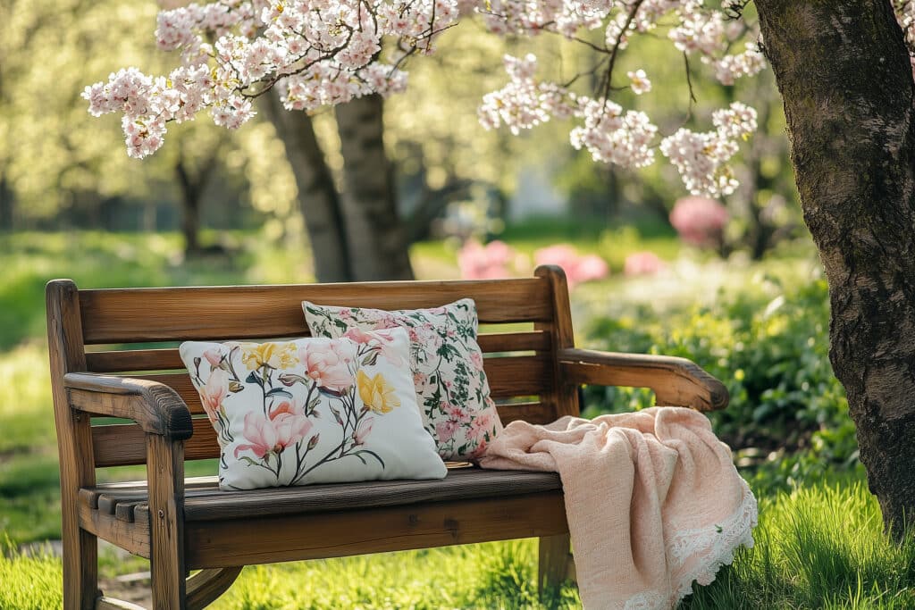
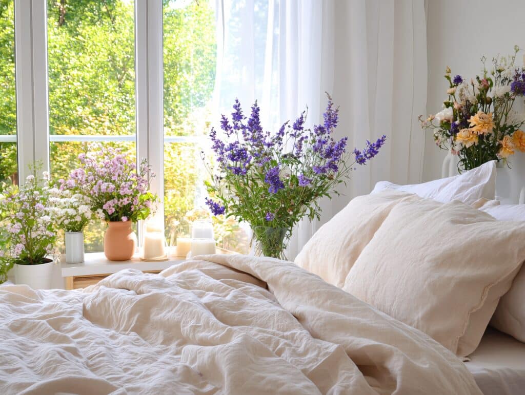
Add fresh flowers & greenery

  • Tulips, daffodils, or cherry blossom branches bring the outside in.
  • Use pastel-coloured pots for plants like ferns, ivy, or lavender.
Colorful flower pots filled with blooming plants against a blue wall
Pastel pots add a soft, seasonal touch to ferns, ivy, or lavender

Change Up Your Bedding & Towels

  • Light, breathable fabrics like cotton or linen in soft colours make a bedroom feel airy.
  • Swap out dark or heavy towels for crisp white or pastel ones in bathrooms.
Bright bedroom with natural light and floral arrangements on windowsill and bedside table
Soft cotton and linen in light hues create an airy, spring-ready bedroom.

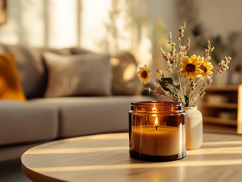
Play with Scents & Lighting 

  • Choose citrus or floral-scented candles to enhance the spring feel.
Candle burning
Citrus and floral scents bring the essence of spring indoors
  • Replace warm-toned lights with natural light or soft white bulbs for a brighter, fresher feel. 
Table lamp
wap warm lighting for soft white bulbs or natural light to brighten your space.

Tutor Top Picks for Spring Colour Palettes

We asked our expert tutors to share their favourite colour combinations for spring. Here’s what they had to say: 

🎨Carla | NDA Tutor

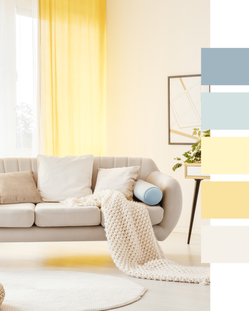
This soft spring colour palette is my personal favourite as creates a sense of calm while still feeling fresh and uplifted. It is a mix of pastel yellows, baby blues and warm neutrals.

Tone collection
Carla’s favourite spring palette: pastels for a calm, fresh vibe.


💎 Simone | NDA Senior Tutor

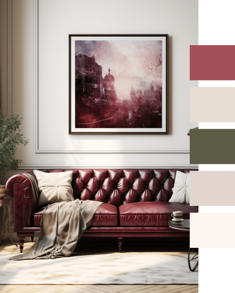
Warm neutrals provide a grounding base, while jewel-like tones add depth and visual interest. This palette celebrates spring light while deeper accents anchor key features.

Tone collection
Simone’s favourite palette: warm neutrals and jewel tones for depth and balance.


💜Amy | NDA Senior Tutor

Spring can be difficult for those of us who like a darker aesthetic, but this is the perfect time to incorporate dusty lavender, cool greens, sheers and accents of black to punctuate a space.

Tone collection


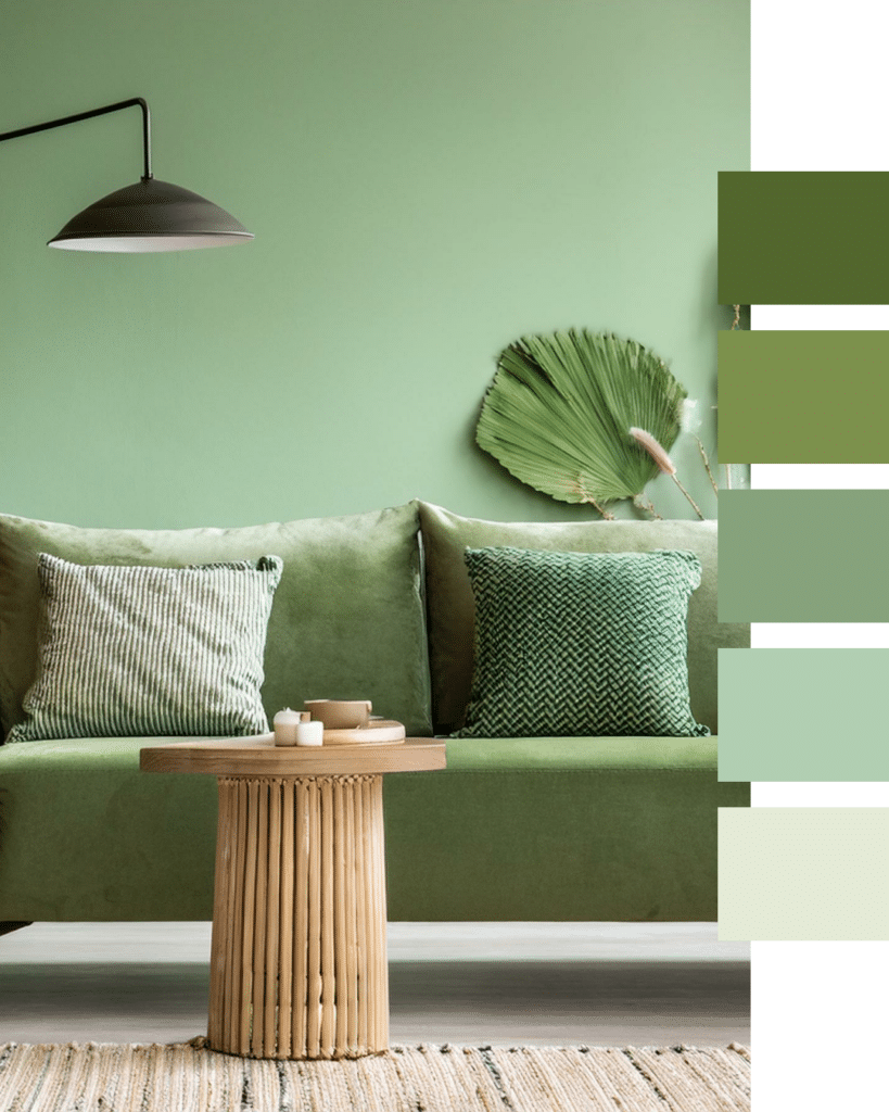
🍃 Sarah Watts | NDA Tutor

This muted shade of green is perfect for a space flooded with light. Natural materials along with an abundance of plants creates an inviting space to sit back and relax and take in the warmth of the sun.

Tone collection
Sarah’s favourite: muted green and natural materials for a light-filled, relaxing space.

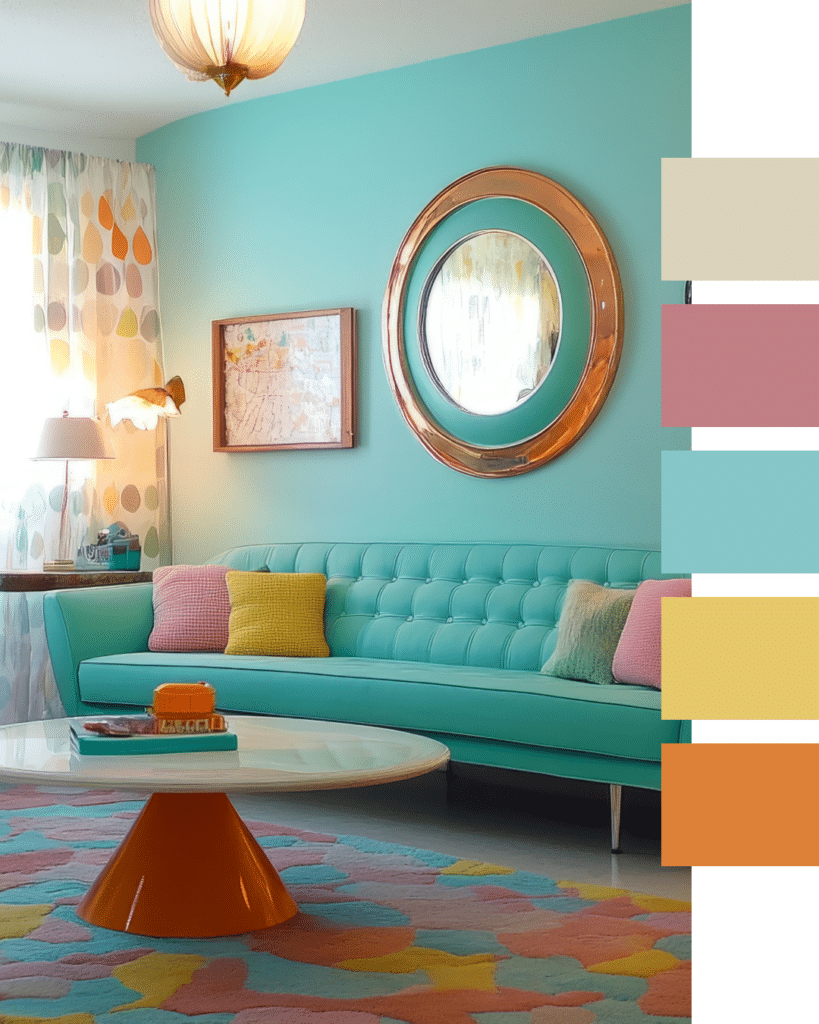
🎉Andreia Vidas | NDA Tutor

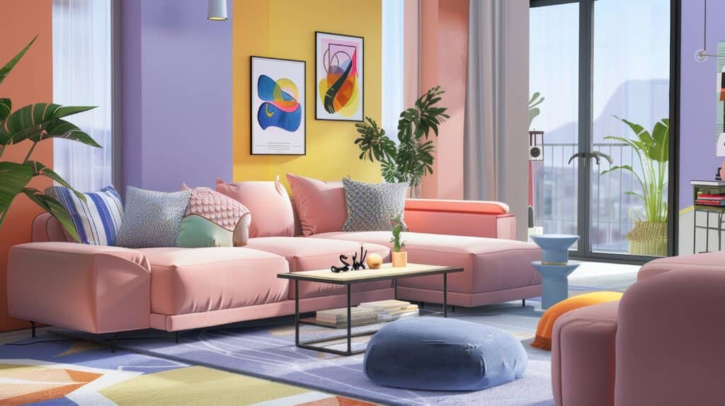
A mix of soft pastels and bold colours can create a lively and refreshing springtime atmosphere. This color scheme adds a playful and creative touch to the space while making it warm and inviting, reminiscent of blooming flowers and sunny days.

Tone collection
Andreia’s favourite: soft pastels and bold colours for a playful, springtime vibe

Final Thoughts

Spring is the perfect time to freshen up your home and embrace the season’s colours. Whether you’re making small updates or completely transforming your space, these expert-approved palettes can help you create a home that feels vibrant, welcoming, and full of energy.


What colours are you loving for spring? Let us know in the comments, and if you’re ready to dive into more spring-inspired design ideas, check out our social media pages for inspiration!🤩

Share this Blog

One Response

  1. I love here the combination of colours in different ways.
    I like to challenge the rules, and choose colours that I like although, at first sight may not be the ones that people would choose.
    Having the colours I enjoy, it is possible to enhance the room with furniture or decoration bringing all the colours together to full fill the vision right room which make sense to the principles of colour.

Leave a Reply

Your email address will not be published. Required fields are marked *

Recent Blogs

What is UK Government Funding?

UK students pay approximately 50% of the full course fee – the balance is funded by the UK Government’s Adult education budget (AEB).

The National Design Academy is the only design school to be able to offer this funding as our Diplomas are all fully accredited by AIM Qualifications.