Written by NDA senior tutor, Vicky McClymont
Mustard seems to be a colour that doesn’t disappear from our interior consciousness. Since 2015 (if not even earlier), mustard has been at the forefront of popular interior colour choices and it doesn’t seem to be losing any momentum. In 2018, Pinterest reported a 45% increase in searches for mustard interiors, whilst in 2016 and 2019, the Dulux ‘Colour of the Year’ featured mustard-like tones of ‘Cherished Gold’ and ‘Spiced Honey’ respectively.
However, just like fashion, interiors come full circle. The use of mustard tones is not a new thing – think back to the 1970s where mustard was the go to colour. 1970s furniture styles and patterns are seeing somewhat of a revival, so it makes sense that the colour palette is also given a contemporary update.
In Pinterest’s ‘Back to Life’ report (2018), the image collection and sharing social platform revealed that many Brits see Autumn as a time for new beginnings and a fresh start, decluttering and reorganising our homes in preparation before the cold weather sets in. This is also a great time to introduce new colour palettes in to your space, and with mustard evoking a sense of warmth and cosiness, it is sure to be, yet again, another popular choice for interiors this year.
If considering using mustard in your home, take a look at some of the ideas below for how you can introduce the colour in a number of ways.

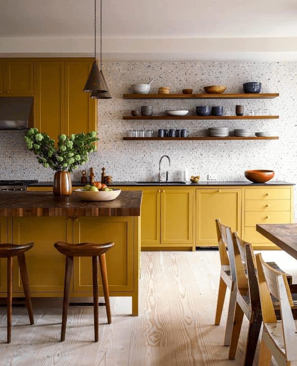
Mustard as a primary colour in your palette
Mustard being such a versatile colour can be used successfully as any proportion within your colour scheme; whether this being the primary, secondary or accent colour.
Using mustard as the primary colour in your scheme will make your space feel homely and liveable, and coming from the yellow colour family, tones of yellow can improve memory and help to relieve symptoms of depression; a key feature as we move in to the darker months where Seasonal Affective Disorder (S.A.D) affects 29% of British adults.
Going bold with mustard and using this a major percentage of your colour palette will make quite the impact. To balance the tone, complement this with some indoor greenery, tones of blue, pale to mid-tone woods or clean white.


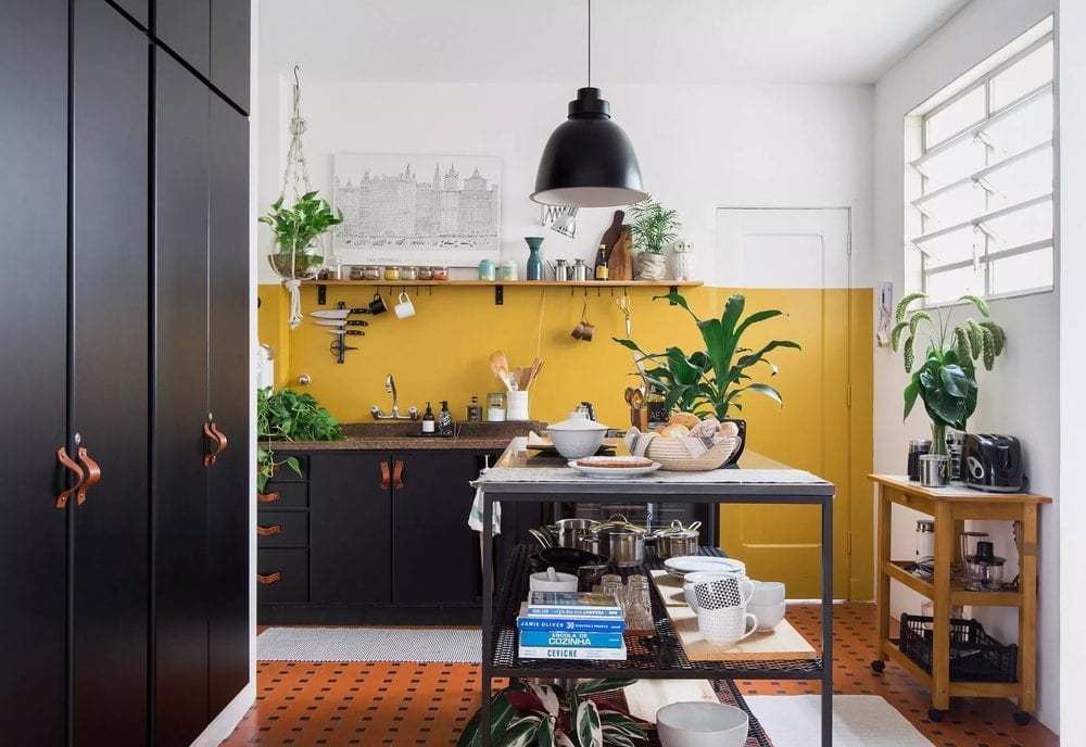
Mustard as a secondary colour in your palette
Using mustard as the primary colour in your palette may be a little too ambitious for some. If you still want to feature mustard within your scheme, using it as the secondary colour to balance out your primary palette works just as effectively. The room will still enjoy the benefits of the warm tones, but will play a more supportive role and will help to ground the scheme.


Mustard as an accent colour in your palette
An easy and cost-effective way to revive your interior without redecorating the entire space is to bring in some new accessories and soft furnishings. Using mustard as the accent colour, or even as a key design piece, such as a sofa, will add subtle but great interest to a scheme. It is also a great way to introduce colour if you are not overly confident with creating bold colour palettes.


Whether a full on, bold approach to mustard or a subtle introduction, your interior spaces will benefit hugely from the addition of this warm and homely colour. Will mustard be your colour of choice for an autumn home revival?


One Response
Well done!