


According to a recent blog in Living etc, Aqua is set to be one of 2023’s most popular home décor trends. ‘But isn’t that just a continuation of the teal schemes we’ve seen everywhere?’ we hear you cry. To the untrained eye, it may indeed look similar to the enduring teal palettes of the last few years but Aquamarine is an entirely different animal.
Think Tiffany boxes, water in a tropical paradise, Bombay Sapphire and the prevailing scent of the 1990’s – Davidoff’s Cool Water – aqua marine is teal’s younger step-sister. Young, funky and slightly cool, aquamarine injects a bit of fun whereas teal is more of a relaxed, intelligent and atmospheric shade.
Home décor trends come and go and every once in a while, something special appears. This year we have two colours set to dominate the world of design – Pantone’s Viva Magenta and Aqua. And both have the wow factor. After three years of bland and muted shades influenced by health and wellbeing, colour is back with a bang! We want to be energised, no soothed. We want to be inspired, not pacified.
Aquamarine is a stimulating shade designed to invigorate the senses and depending on how it’s used can still have soothing properties. We’re not saying it’s a shade you’ll love forever but if you want to inject some energy into your home this year it’s a pretty good place to start.
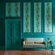
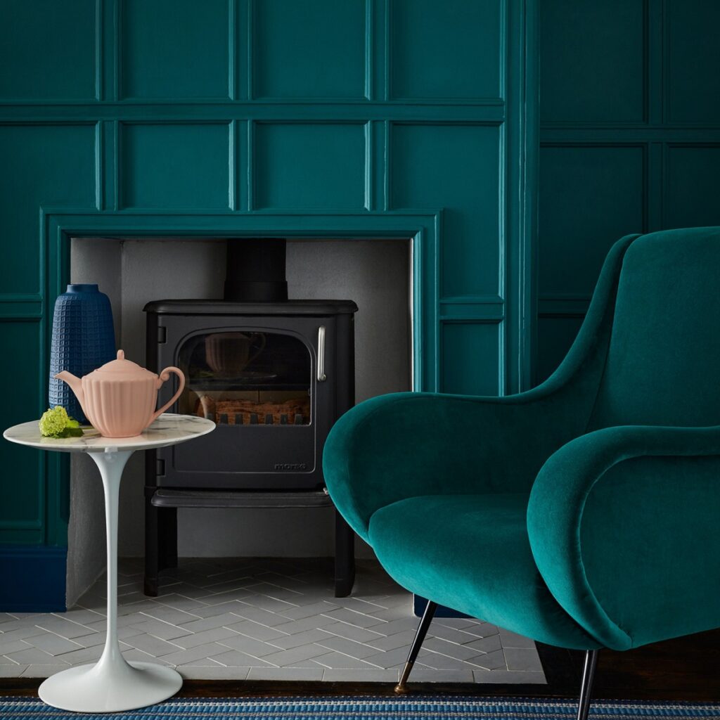
The teal home décor trend we’ve all seen everywhere was almost a rebellion against the pre-pandemic prevailing trend of grey. It was bold and brave – the complete opposite of the safe blandtrend which infected everything from interiors to exterior doors and windows.
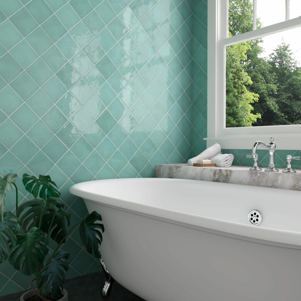
Aquamarine shares similar properties with teal – it sits between green and blue on the spectrum and both can be invigorating. Where aquamarine differs is that it’s a cooler shade than teal. Where teal is dramatic, aqua is lively. Teal creates an atmospheric scheme suited more suited to resting areas like bedrooms or living rooms, whereas aquamarine is more vitalizing making it perfect for bathrooms or areas of the house where you want to feel alive.
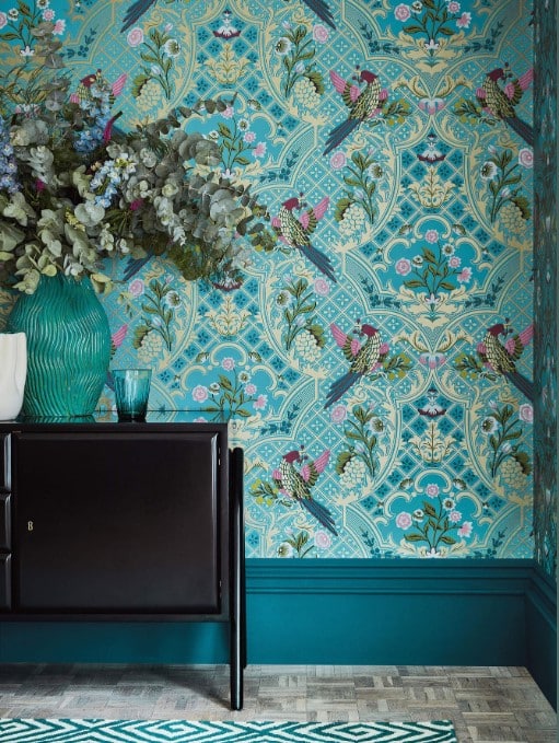
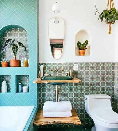
Less can be more when incorporating the Aqua home décor trend. Used as an accent colour or feature, aquamarine can inject a colour pop which draws the eye. Go for all four all four walls and it’d be aqua-overload. There are also some great wallpapers out there such as the Sanderson Yukka print mentioned in the Living etc blog. Little Greene also have the Brodsworth design or if you’re looking to work the aquamarine home décor trend in a more subtle way their Aquamarine paint offers a more tranquil shade. It may be more towards the green side of the spectrum but we’ll forgive it.
Bathrooms are a great place to incorporate aqua into your home without it being too OTT. Even tiles with a hint of aqua can reinvigorate a boring bathroom.
UK students pay approximately 50% of the full course fee – the balance is funded by the UK Government’s Adult education budget (AEB).
The National Design Academy is the only design school to be able to offer this funding as our Diplomas are all fully accredited by AIM Qualifications.