
Little Greene is one of the world’s foremost specialists in the production of sustainable and traditional paints and wallpapers. Dating back to 1773, Little Greene was established on the outskirts of Manchester, and over the last two and a half centuries has become known for its high-pigmented, environmentally friendly paints.
Partnerships with National Trust and English Heritage prove Little Greene’s pedigree in the world of heritage interior design so we asked tutor Andreia to speak with Little Greene Colour specialist, Simon Hutchinson, to find out more about working with colour in period properties.
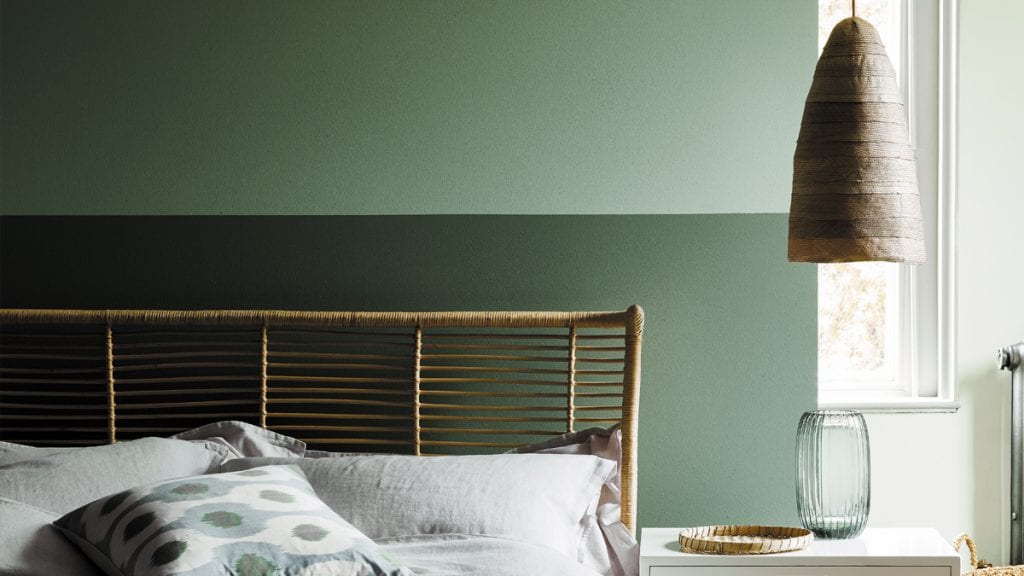
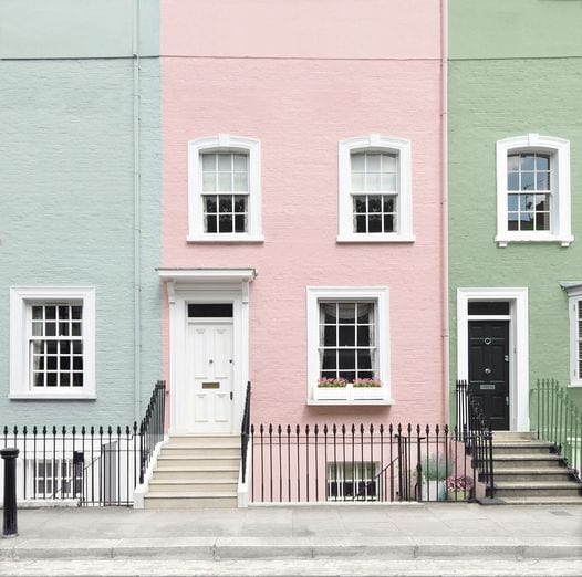
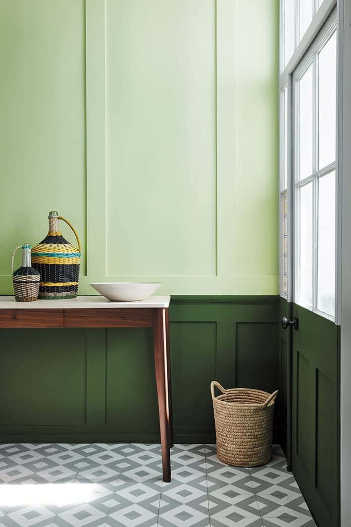
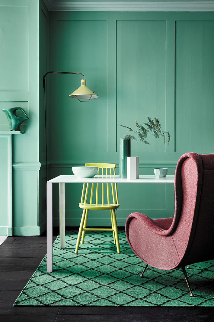
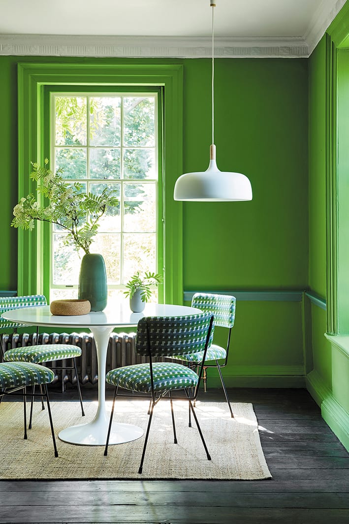
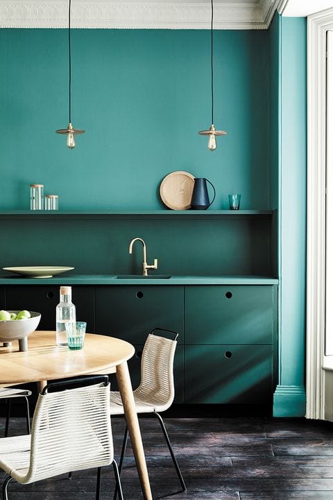
Little Greene is well known for its heritage ties and respect for traditional techniques and this is strongly evidenced within every collection. The National Trust Green paint collection is a testament to that. What can you tell us about the techniques used here? How much of the traditional approach was implemented to develop this collection?
The National Trust Green collection was born out of many months of research and I’m personally very fond of the collection as there is a mix of hidden colours that were used in the past and also colours that are still in-situ that you can still go and see.
The initial stage of collecting data from various sources is a case of taking many trips to National Trust properties armed with a Spectrophotometer (a device for measuring and storing colour) and a trusty small knife to take paint samples. The paint samples are then set as cross sections to try and delve into the past whilst the data from the Spectrophotometer is downloaded. This way of working and the subsequent colour mixing is a great example of mixing old and new techniques. The Spectrophotometer is fantastic and a very useful bit of kit as it essentially collects and digitises the colour, in many ways like a microphone does with sound. It is a far more practical operation than trying to hand mix colours with a palette on site.
The traditional method comes in the mixing of the colours, which are meticulously re-created and samples made. We take great care in the formulation of these colours and try to keep them looking as close to the originals as possible. This isn’t just matching the colour but also using pigments that are sympathetic to the original formulation. For example, if we found an original ‘Brunswick Green’ made up of Prussian Blue and Chrome Yellow, we would try and make our green based on ‘blue’ and ‘yellow’ and through trial and error, find out which of our pigments work best to achieve this and create a colour that reacts under different lights in the same manor as the original. There is now software that can match colours but I find that they can never re-create the human intuition of colour mixing and that the traditional method of ‘a little of this, a little of that’, still reaps the best results.
Once all these colours are made, we start narrowing the process down, taking out any colours that are not suited or too close to other colours in our current range. This is a surprisingly lengthy process and I can say that for every colour in there, there are probably ten that didn’t make it.
Click to Englarge
The Little Greene partnership with National Trust and English Heritage brought up the possibility to work with unique and classic designs which resulted in both Archive Collections. What advice would you give in terms of wallpaper selection for a period house?
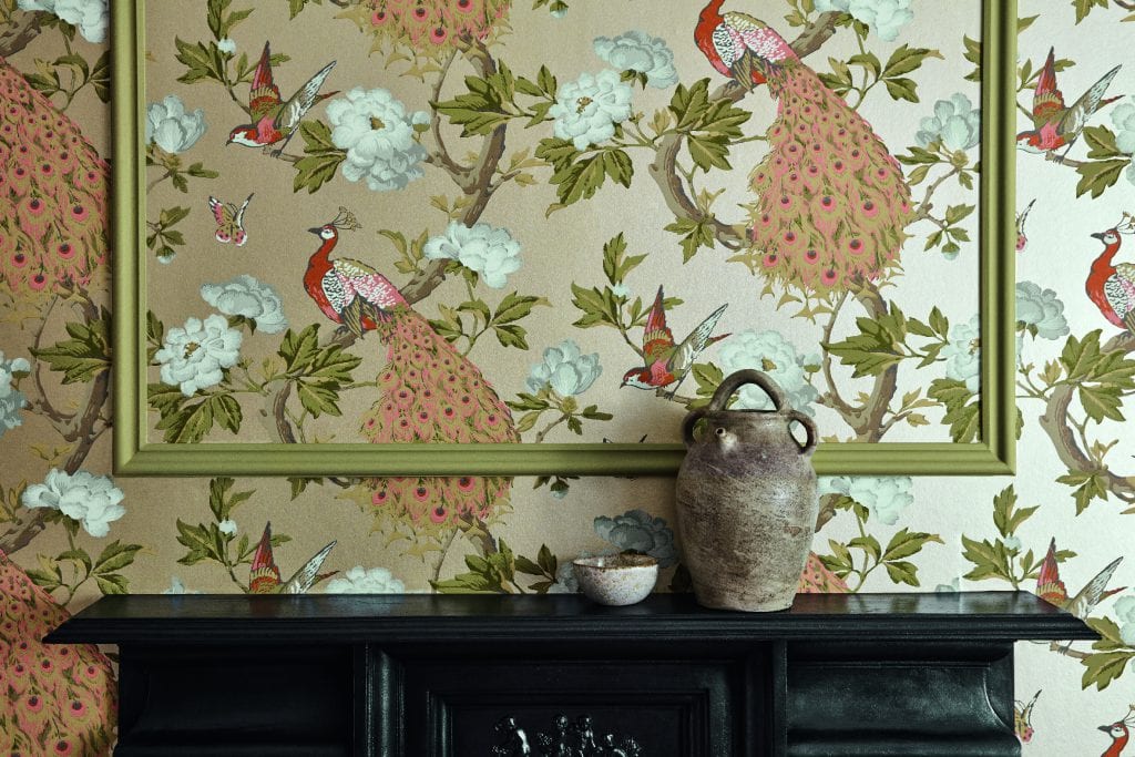
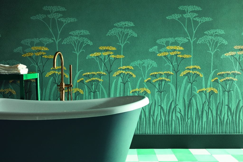
Our wallpaper collections include designs from the past 300 years of decoration so there really is a design suitable for every property.
You may choose to opt for a wallpaper design that originates from the same period as your property and use this in quite a contemporary way.
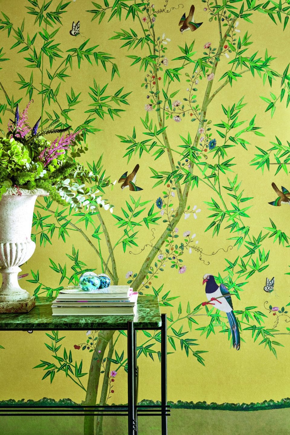
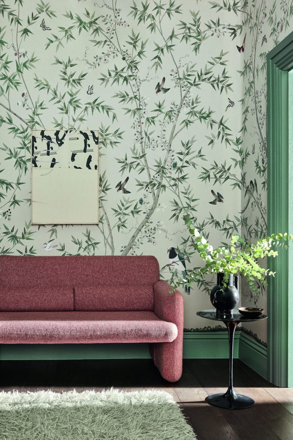
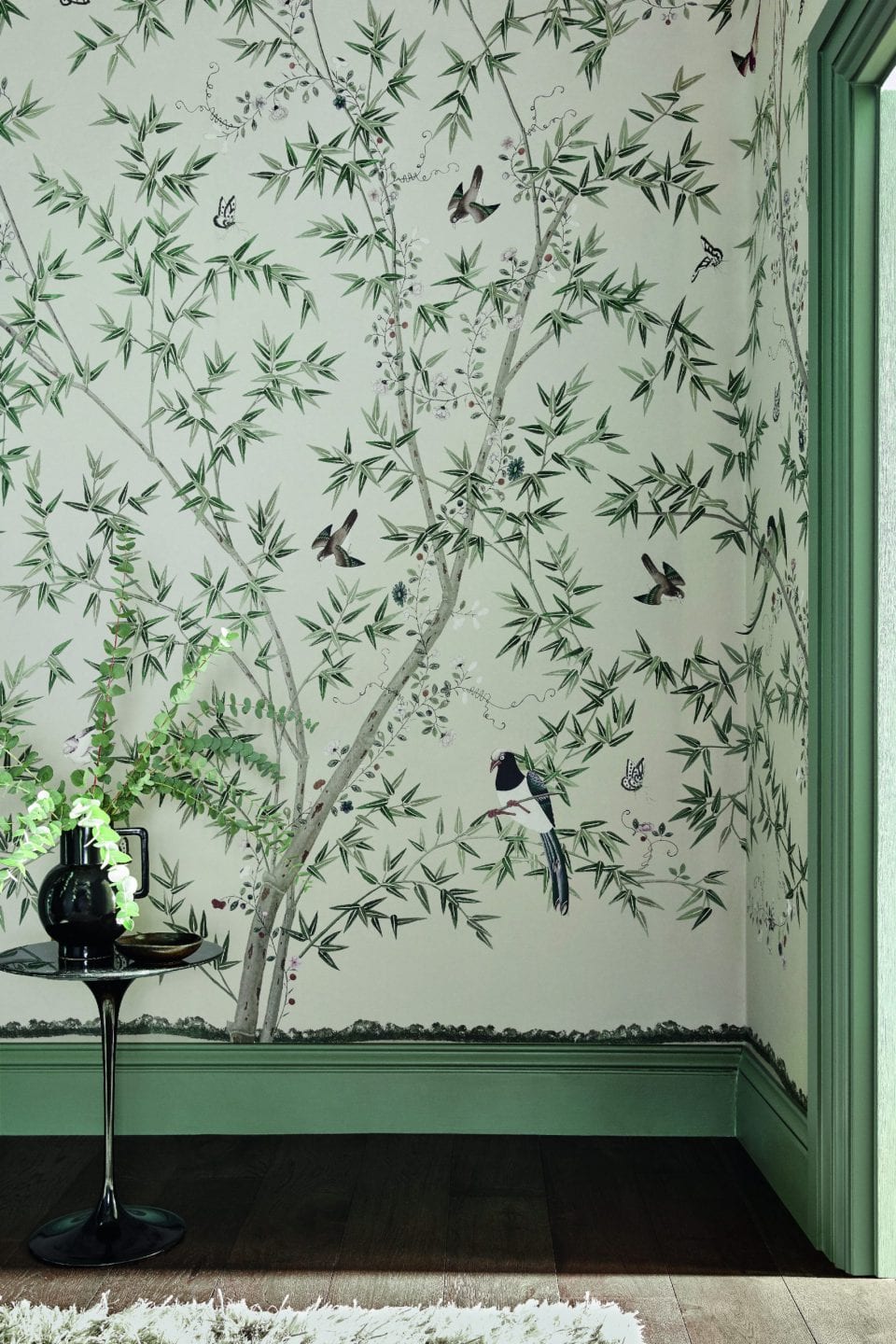
When selecting a wallpaper design, the most important consideration is how you would like the space to feel. For a tranquil scheme, look to more natural designs, our ‘Belton Scenic’ mural dates from 1785 and can be seen in the Chinese bedroom at Belton House in Lincolnshire. The charming interaction of bird, butterflies and flowers creates a scheme that is reminiscent of the outdoors.
For something a little bolder and more impactful, try a larger scale pattern such as ‘Hencroft,’ This design – a stitched, repeating pattern of stylised cowslips – was found at Thomas Wardle’s school of embroidery in Leek.
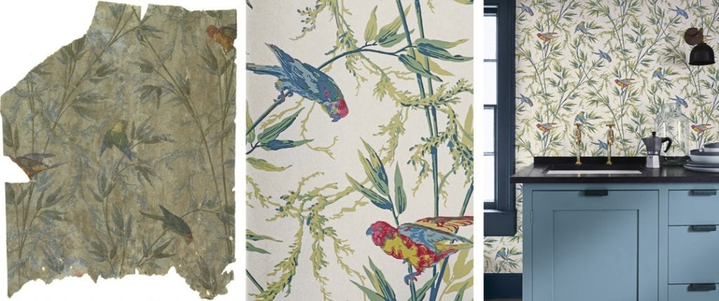
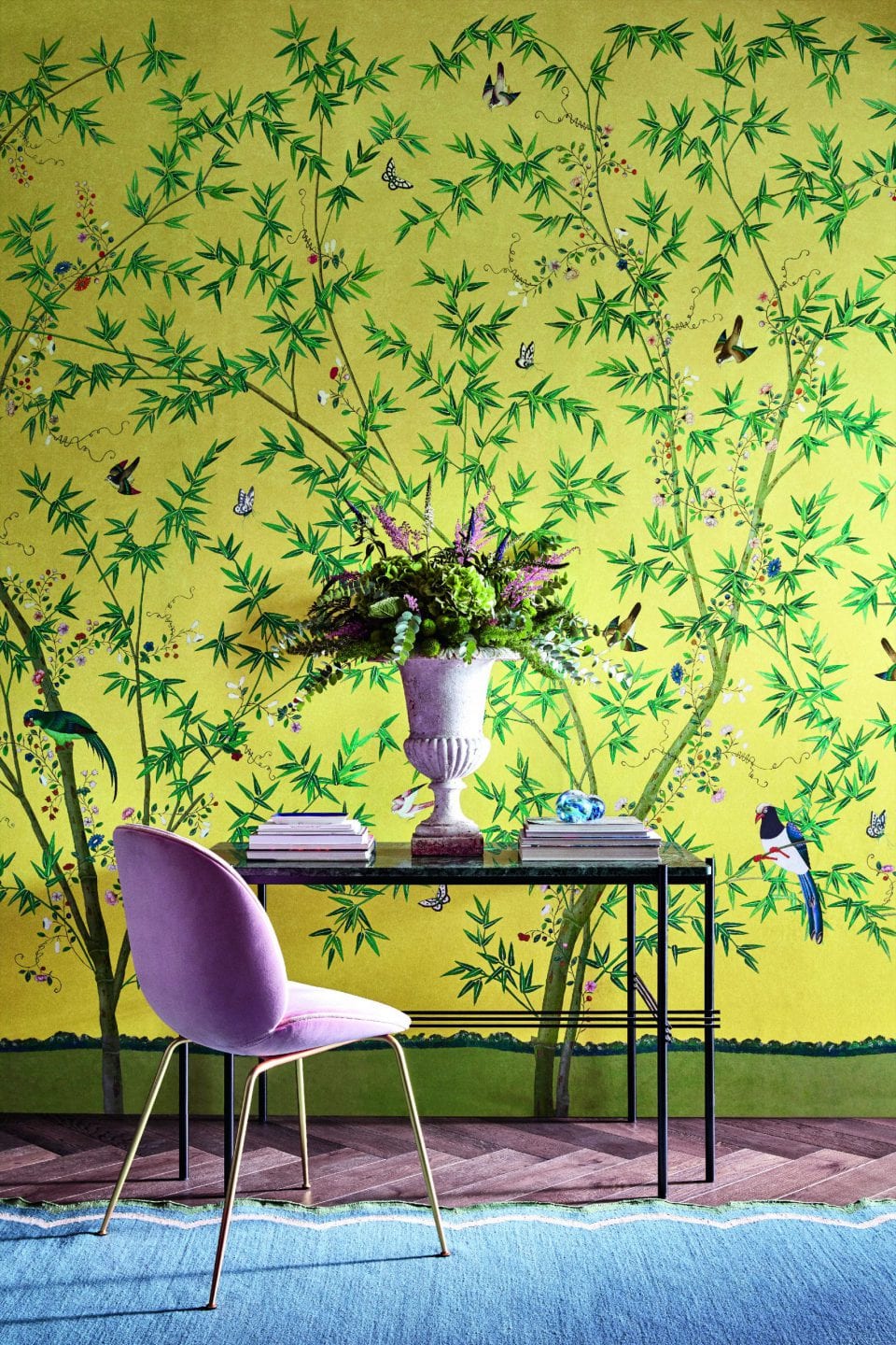
Click Image to Englarge
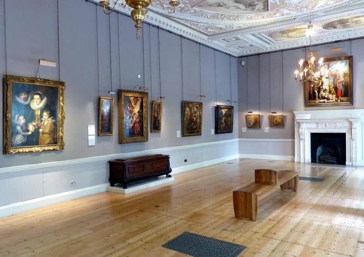
The Old Vic Theatre was one of the most recent projects that Little Greene was involved in terms of colour selection. What can you tell us about this project and why it was so important to maintain a historical accuracy within the colour scheme?
The Old Vic was a very interesting project as it was a very good illustration of not so much historical accuracy but lateral thinking and problem solving.
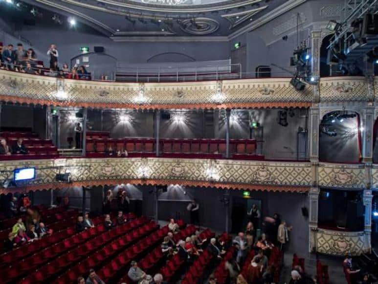
Although a small amount of paint analysis was conducted, it was agreed that a continuation of the current decoration within the theatre was the best option. This was a little complicated as during the research, it transpired that despite appearing to be one continuous dark grey colour, the Auditorium was in fact 5 or 6 subtly different shades. This was no doubt due to various parts being re-decorated at different times and posed the question of ‘which one do we pick?’ I took several colour readings from different areas around the auditorium and created 3 paint variants based on an average of all the colours. One of these was approved as a final colour and is now a Little Greene Bespoke Mix for the theatre, available whenever they require it and aptly named ‘Old Vic Auditorium Grey’.
You can read more about the Old Vic Project here on the Little Greene website.
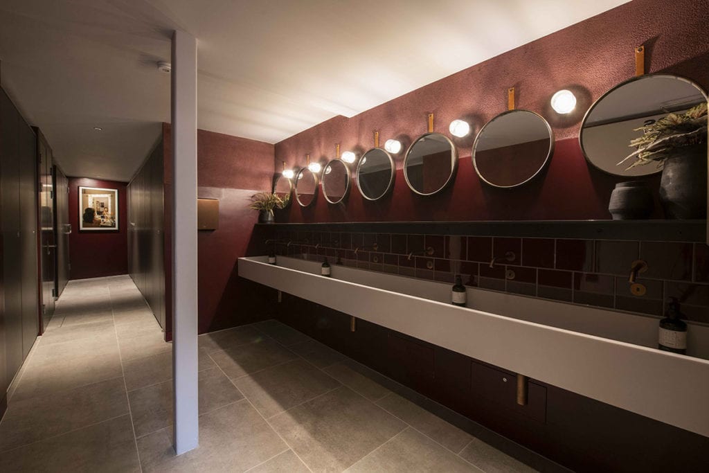
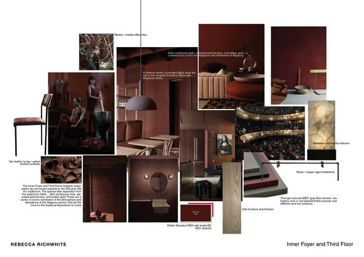
The Old Vic renovation project was coordinated by interior designer Rebecca Richwhite.
The brief was to reinvigorate the theatre whilst retaining the heritage features and vision of the Old Vic – somewhere welcoming, unintimidating and surprising. You can see Rebecca’s original designs over on her website.
Conservation projects require a strong base of understanding of the property’s history, style and fabric in order to re-create a specific historical colour and wallpaper. Can you tell us about the overall process behind it?
When it comes to any project, the more information you have, the better the results tend to be. Working exclusively with paint samples can get you so far but getting to know the history of the building really helps. Particularly with older properties, there are records of when decorations occurred in the past which makes piecing things together much easier. I recently worked on a Tudor property in Devon where they had some beautiful examples of Tudor decorative ceilings but in doing a little research and finding documents of building works, it turned out that the majority of them were in fact very good early 20th century copies and as such the need for historical accuracy was not as great.
There have also been occasions when paint analysis has discovered colours that the client just didn’t like! In this instance, having an understanding of the colours and a knowledge of how to actually re-create them enabled me to produce a set of colours that were sympathetic to the age and style of that particular property but not necessarily exactly what was used in the past. In this and a lot of jobs, it’s heavily dependent on what the client wants and it’s that knowledge of colours that enables me to explore alternatives for them.
What recommendations would you give to someone looking to select your products for a commercial building with heritage ties? What specific colour or collection should they be looking for?
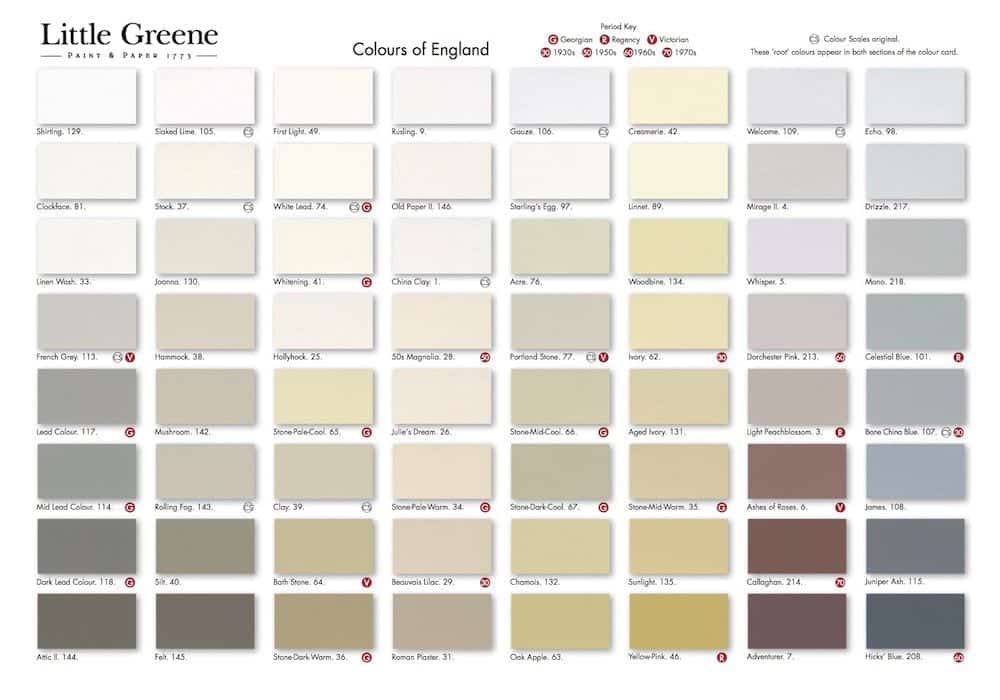
I think first and foremost, they would need to find the age of the building and start from there. Although our colour cards are a beautiful mix of period and modern colours, unlike any other manufacturer, the period colours are labelled with their origin, G for Georgian for example. This means that if you have a Georgian property, you can limit yourself to these specific colours, and create a scheme that will be appropriate for the age of the building.
The great thing about Little Greene is that we offer a full range of both traditional and modern finishes. If you’re looking for an authentic historic finish, we have distemper and limewash finishes whilst someone looking for a more contemporary product for modern family living that retains the look, feel and breathability of more traditional finishes, our Absolute Matt Emulsion is a perfect choice.
I think first and foremost, they would need to find the age of the building and start from there. Although our colour cards are a beautiful mix of period and modern colours, unlike any other manufacturer, the period colours are labelled with their origin, G for Georgian for example. This means that if you have a Georgian property, you can limit yourself to these specific colours, and create a scheme that will be appropriate for the age of the building. The great thing about Little Greene is that we offer a full range of both traditional and modern finishes. If you’re looking for an authentic historic finish, we have distemper and limewash finishes whilst someone looking for a more contemporary product for modern family living that retains the look, feel and breathability of more traditional finishes, our Absolute Matt Emulsion is a perfect choice.
What is the most common mistake made in terms of colour selection for a period property?
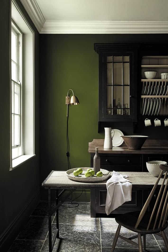
I think the biggest mistake people tend to make, particularly on Georgian properties, is to over complicate things. The colour schemes back then tended to be far simpler than people think and all the ‘picking out’ of architectural details tended to be a more modern interpretation. Colours were often used across the entire wall or panelling from floor to ceiling with a simple ‘Whitening’ or soft distemper on the ceiling.
Another common misconception is that ‘old’ colours were ‘muted’ and subtle. Bold, bright shades such as ‘Blue Verditer’ were commonly used in the Regency period.
I have to say that my biggest bugbear is the use of ‘brilliant’ white on the exterior of period properties. You see it an awful lot but in my opinion this often looks too stark. These houses were made before Titanium Dioxide was used as an ingredient in paint as a whitener and were never intended to have such a sharp white. They look much better with a pale stone colour such as ‘Portland Stone Pale’ or our ‘Lead Colour’ that is based on the traditional use of lead carbonate.
Little Greene is currently involved in the Courtauld Gallery renovation project. What can you tell us about this project?
The Courtauld has been a lovely project to work on not only because it’s a beautiful building but also due to their open minded and friendly team. The philosophy on this project isn’t to slavishly re-create the past but to create a scheme that is sympathetic to the building’s architecture and age. It’s a philosophy that I heavily agree with and use on nearly all my projects that are private houses. I think that this idea of looking to the past for inspiration and using historical knowledge to create a complementary scheme is something that works brilliantly on all period properties.
The Courtauld, like the Old Vic Theatre is a constantly evolving entity inside a beautiful old building, so I don’t think either of them need to be carbon copies of a by gone age. They’re looking to create something that draws from the period and use this as inspiration to keep the values and intentions of the original designs, whilst appealing to a modern audience.
Finally, with social awareness rising in terms of sustainable approach there is a higher demand for environmentally conscious products. What steps is Little Greene taking to reinforce their sustainable stance within the brand and the heritage sector?
Our environmentally friendly paints and wallpapers are amongst the highest quality available. Our water-based paints exceed all legislation on VOCs and our oil-based paints are produced using naturally occurring vegetable oils which have replaced harmful solvents. All our packaging contains recycled materials and can be recycled again upon disposal.
Find Out More About Little Greene.....
We’d like to thank Little Greene and Simon Hutchinson for taking the time to answer our questions. Head over to their website to find our more about their stunning period paint colours and heritage wallpaper designs.

