Choosing a colour scheme is usually the starting point for a DIY interior design project. It’s pretty much the glue that holds the whole thing together. This week we decided to request the help of a student and expert in colour schemes, Molly Windels-Lyte, aka @moleo.design
Introducing Guest Blogger, Molly.....

Hello, I’m Molly and I am currently working through the NDA’s degree in Design for Outdoor Living. I also work for Farrow & Ball. I live in a tiny wooden house in the Sussex countryside with my husband and 2 little kiddos.
It may sound like an obvious passion but I love colour! It’s an essential element of interior design and brings a whole scheme together but it’s also so important to our mental health and wellbeing. Colour has an impact on our everyday lives, triggers emotional responses – as well as just being a fabulous tool to express our amazingly unique personalities! Here’s my guide to getting your colour scheme right in your home.
Choosing a Colour Scheme Can be Overwhelming
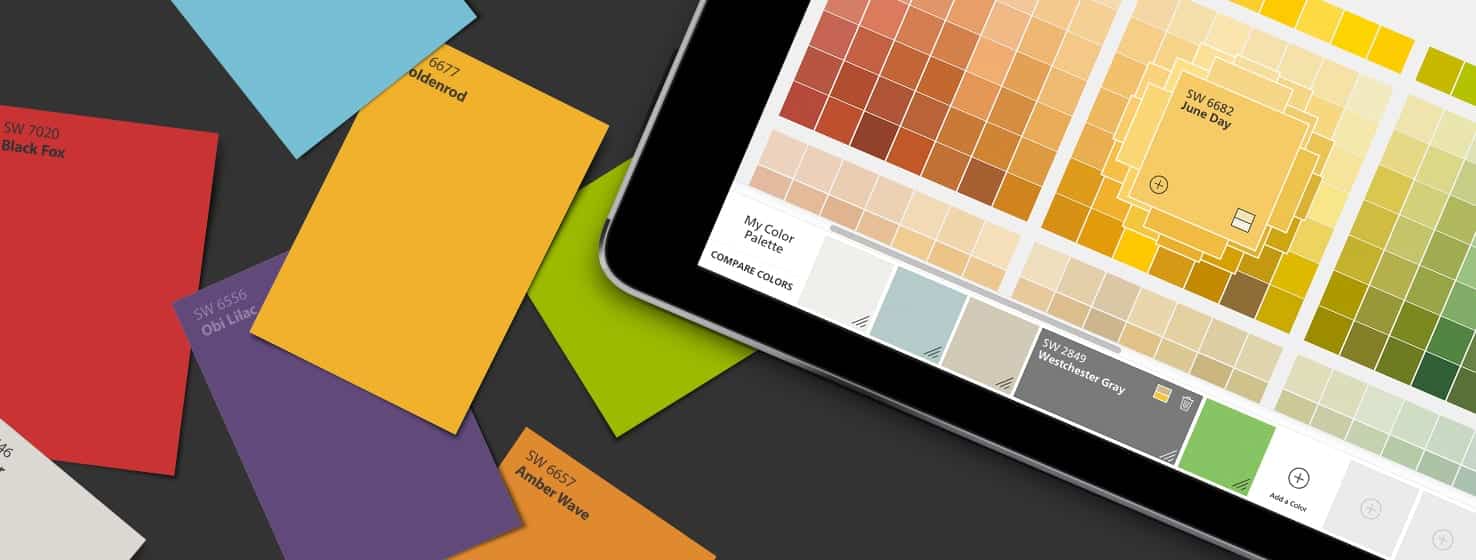
Choosing a colour scheme can be overwhelming, especially when you are decorating a larger space or an entire home as you most likely want one room to flow freely into the next. It’s easy to find yourself spending a fortune on little sample pots and colour fans by various companies and actually discovering that you’ve hoarded enough to open your own little paint shop. Then you finally choose a colour, paint it on your wall and then immediately regret it. So many of us have lost our trail and made expensive mistakes but with thorough planning, you will succeed! I have compiled a list of factors that I think are really important to consider before you embark on your colour chasing journey.
Questions to Ask Yourself When Choosing a Colour Scheme
1. Consider how you want to feel in the space
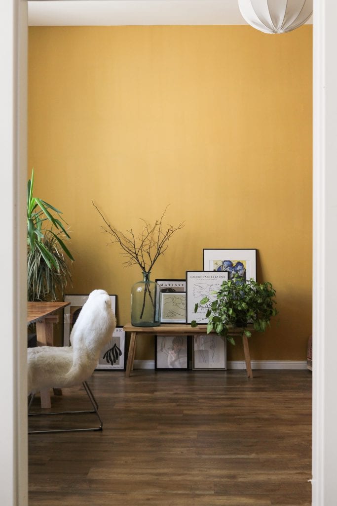
Do you use this space to chill, unwind and relax? Is it a joggers and Netflix zone? Or perhaps this is a room you want to flaunt to your friends with fancy décor and flashy furniture. Thinking about how you want to feel in the space will spark inspiration and ideas to stream because you’ll notice how colours make you feel. Often, we think about the colour before the emotion, but try swapping it around. Do remember that colour psychology is so very personal. For example, yellow might make one person feel happy and positive whilst it makes another feel uneasy and unsettled so if it is for a guest bedroom, it might be best to stick to a neutral palette.
2. When do you use the room?
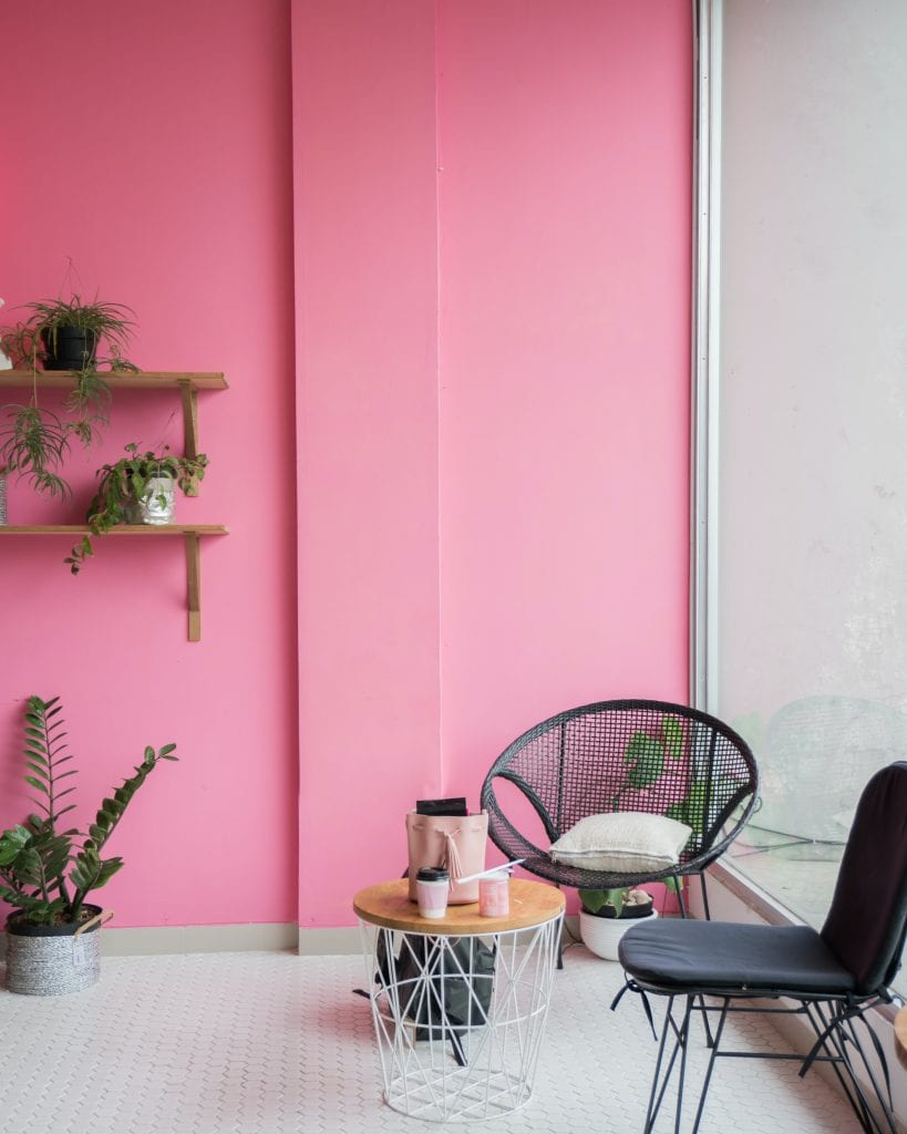
Deciding on what time of day you will be using the room is so important. Is it for a bright breakfast area in your kitchen where you spend most mornings, or is it a comfy lounge you only ever see once the kids are in bed? Light affects colour so much, especially when it comes to top-quality, highly pigmented paints. If you don’t already know the aspect of your home, it is fairly simple to use Google Earth to generate a sun path so you can plan your colours accordingly. North facing rooms usually bring out cooler tones so if you’re going for a lighter colour, it’s probably best to avoid anything with green or grey undertones as you’ll risk creating a cold atmosphere. If you want to go dark, it is perfectly okay to embrace the cooler undertones by going for a black with a blue or green base. If you do want to keep it light, consider opting for yellow-based neutrals like light creams or even just a warm, sunny yellow. West facing rooms are cooler in the mornings and lighter in the afternoon and early evening, and the opposite applies to east facing spaces so choose colours that work to your advantage. With south facing rooms you will have more freedom with colour as it will always feel warm with plenty of natural sunlight.
3. Does it reflect your personality?
This is an interesting one as it totally depends on how daring you are when it comes to colour. Some people just love vibrancy and will have any colour anywhere and if that reflects your personality then that’s great, it’s going to be you living there after all! Others might be a little bit more hesitant when it comes to bold, so make sure you do you. When people push themselves out of their comfort zone and don’t fully love it, they tend to tire of the colour scheme easily when it’s not truly ‘them’. On the other hand, it’s important to push yourself out of your comfort zone – as long as you like the result! It’s easy to look on Instagram or Pinterest and fall in love with ideas but think to yourself, is it really you?
4. How many rooms are you redecorating?
If it’s just your shed you’re painting, then you might want to go a bit wild and do whatever you want. If you are doing your entire house it is so, so, so important to think about all of the rooms in your home collectively. Sticking to the same undertones throughout will create a cohesive flow between your rooms, giving a softer and more comfortable colour scheme. A common mistake is thinking for example, “we’ll stick to greys”, and then choosing a cool blue-grey in your living room, a warm red-grey in your hallway, a green-grey in your kitchen, as all this does is bring out and exaggerate unwanted tones. Another way to achieve this would be to go for a monochromatic scheme where you would choose one colour, and then play with the tints, shades and tones throughout. This would mean that the undertones would be the same but the white/black/grey level changes.

With the above questions in mind, have a think to yourself about how colour makes you feel. Look at a colour wheel and come up with a list of emotions that they trigger for you. Gather inspiration from Instagram and Pinterest and always start with your favourite room in your house and work around that. Is there a sentimental ornament or piece of furniture that you just love and want to keep forever and want to base your scheme around that? That’s also a good place to gather inspiration from, perhaps you could pick colours out of your favourite fabric, artwork or print.
I do hope that with those considerations you are able to plan your colour scheme with more detail and feel less overwhelmed with the infinite choices.
Find out more about Molly....
Follow Molly as she shares her best tips for incorporating colour, working with small spaces and designing drop-dead gorgeous outside living areas – @moleo.design