As the saying goes, we have been taught to never ‘judge a book by its cover’; meaning we should never prejudge the worth or value of something by its outward appearance alone. Whether this be people, things, ideas, even interiors, it can be easy to become quite superficial about new experiences. However, rather than metaphorically, what if we actually do judge a book by its cover.
The importance of good book cover design
The design of book covers are now more important than ever; they not only give a visual representation about the context, content or genre of literature, but are the first step in drawing in a reader, with the possibility that the reader becomes consumer. With the emergence of e-readers, the visual aesthetic and outwards appearance of physical books has never been as important as it is today.
Just like with the emergence of online shopping, retailers had to think of new ways to entice shoppers back in to their stores. It all became about offering “an experience” to the shopper, making their journey a worthwhile one, and not solely about the product they were purchasing. The same thing can be said with books. The rate of purchases for physical books has been in quick decline over the past ten years, however, in 2014, although still declining (in comparison to that of e-books) the rate of decline slowed. The purchase of physical books (fiction, in particular) is perhaps now seen as a little bit retro, perhaps even a bit ‘hipster’, although the purchase of reference books (such as architecture, design, theory etc) has proved steady.
So as publishers are now placing more emphasis upon the design of book covers, we take a look at some of the more creative, inventive and enticing of these.
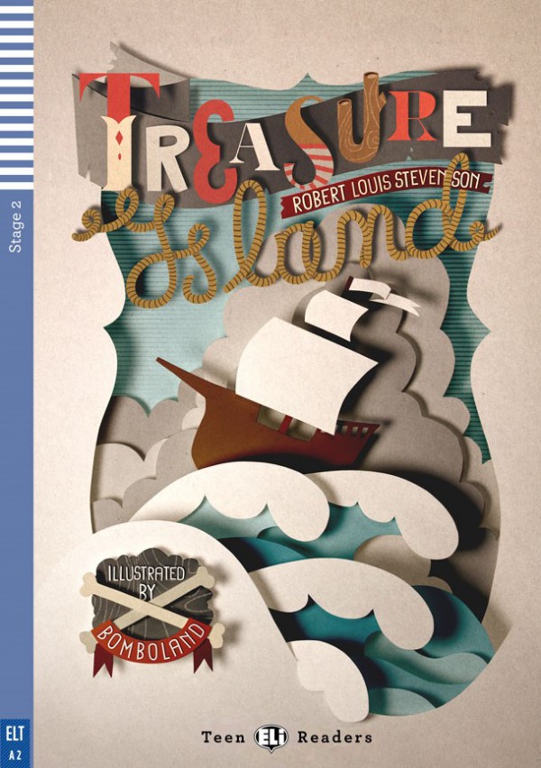
The re-imaging of the Robert Louis Stephenson classic, ‘Treasure Island’ was developed by Italian illustration studio, Bomboland. The fantastic use of digital layering gives the effect of movement and adventure, as well as giving depth and a 3D effect.
From books to movies
Designer Tom Lenartowicz has created an inspired, simple, yet hugely effective cover for Peter Benchley’s novel, ‘Jaws’. The design of the cover, whilst really only having three main elements, has managed to capture the sense of foreboding, danger and horror associated with the story (many of you may be more familiar with the Stephen Spielberg film adaptation).
‘What lurks beneath’ is a thought never too far away from the design of this cover; from the shark represented by the main title which also becomes the ‘tip of the iceberg’ (what you see on the surface is only a small aspect of something largely hidden). The simple gradient of body colour from teal to black also gives a sense of depth and danger to the water.
Children’s Classics
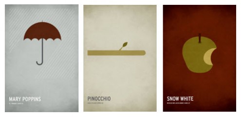
Christian Jackson has re imagined the covers of some of the greatest classic children’s books of all time, including the likes of Mary Poppins, Pinocchio, Snow White, Rapunzel, and Beauty and the Beast. The designs of these covers really strip back each story to its most vital and well-recognised element, with a very minimalist approach given to some quite complex stories.
The book covers focus purely on the story, removing all unnecessary clutter or detail.
Redesigns
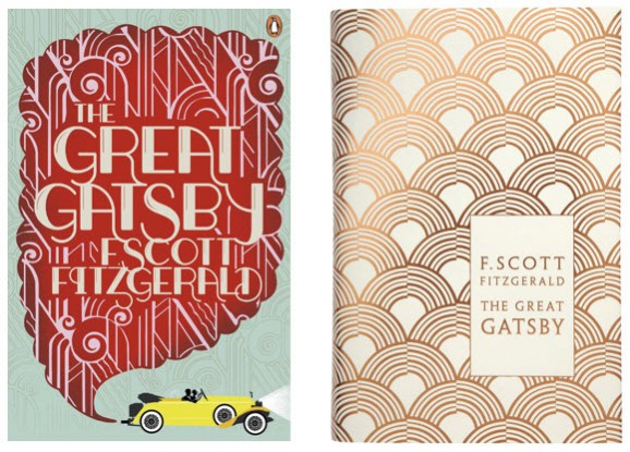
The original design for The Great Gatsby is probably one of the most iconic book cover designs of all time. Even with the highest approval by F. Scott Fitzgerald, this hasn’t stopped numerous redesigns of the classic book being published. There is such a variety of approach when looking across the spectrum of designs for the book, some straightforward, some elaborate, some really capturing the highs and lows of Gatsby’s fortune.
The two shown here really exude the opulence of the time, with scrolling Art Deco print (the book is set at the height of Art Deco in the early 1920s) and of the latter (designed by Coralie Bickford-Smith), using polished gold to really heighten the level of decadence, which is what Jay Gatsby was all about.
Whilst book covers are intrinsic to the content, we are starting to see a real design-led approach to some of the greatest books of all time; they not only look good when reading, but also look great on your bookshelf!


