
Design is subjective. This we know. But what makes a design good or bad? In the second episode of The Awkward Corner, Stephen, Amy and SJ talk about Dieter Rams’ Ten Principles of Good Design and whether you should ever compromise your design principles or coax a client to avoid making a massive mistake.
Scroll to see our tutors favourite design fails and most hated trends as discussed in Episode 2 – Beigefest.
To kick off episode 2, the tutors discuss the work of renowned designer Dieter Rams, a German industrial designer widely known for his consumer products for Braun. Ram’s 10 principles of good design are clearly visible in his work. These principles have influenced many designers from the world of product design, such as Jonathan Ive, who is responsible for designing the iPhone.
So what was on Rams’ list? How did he determine what was good and bad design? Here are the ten principles…..
This underpinning ethos relates specifically to ‘good’ design and is transferable across all design sectors. For Interior designers, focusing on the purpose and functionality of a space is as important as the fundamental concept that drives the aesthetic forward into an understandable and recognisable piece of ‘good’ design.
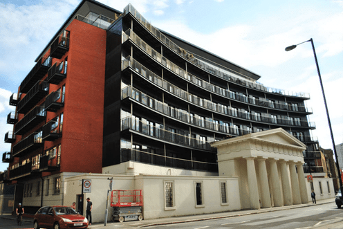
In our latest podcast, Amy raises Facadism – the principle or practice of preserving the front of buildings that have elegant architectural designs, which emerged in the 1980’s.
The example above is the old Unitarian Chapel on Stamford Street in Southwark. Neither the old, nor the new building benefit from this architect’s attempt to preserve a historic building.
A better example of Facadism would be the Shangwei Village Plugin House, designed by the People’s Architecture Office. Here, the new modern house is cocooned inside the old exitisting brick walls which compliments and adds a new chapter to the original building, blending a highly contemporary structure into the traditional neighbourhood.
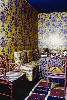
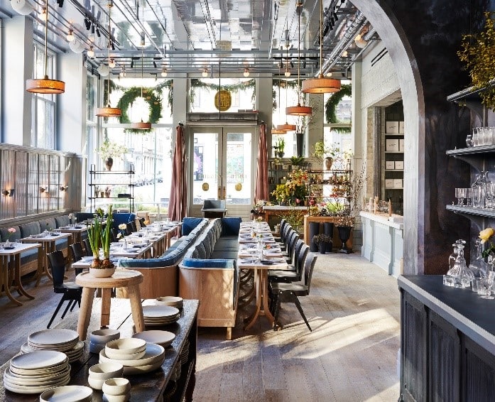
We’re all for being bold with colour and pattern here at the NDA but how do you strike the balance? Maximalism is an enduring trend which can go epically wrong if you don’t apply at least some of Rams’ principles for good design. We’re not saying less is always more, but to get a maximal interior right you need to consider and curate your look carefully.
This first image shows how badly things can go wrong when using big patterns and lots of bold colours to create a maximalist scheme. Using the same or similar patterns and colours everywhere can completely overwhelm any good intentions.
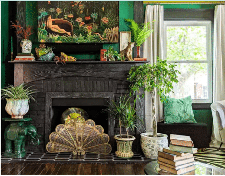
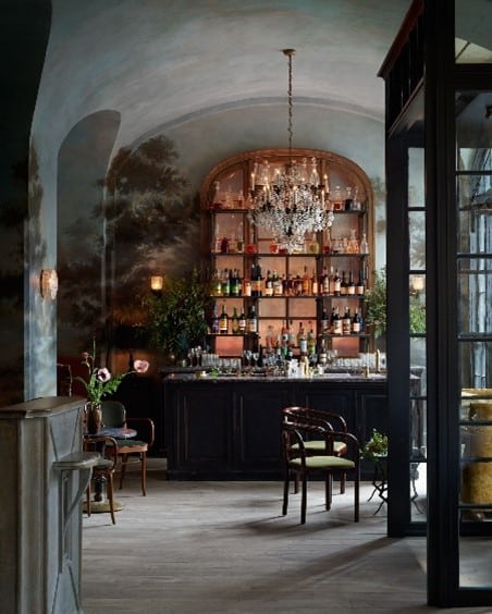
The second image demonstrates that you can still achieve a maximalist look whilst only using one specific colour in varying tones, layering the desired look with plants, textures, textiles and artwork, which when grouped together are not simple at all. As long as there is a sense of layering and playfulness alongside the bold gestures, suggesting a specific intent in the design process, you’ll succeed in making maximalism work.
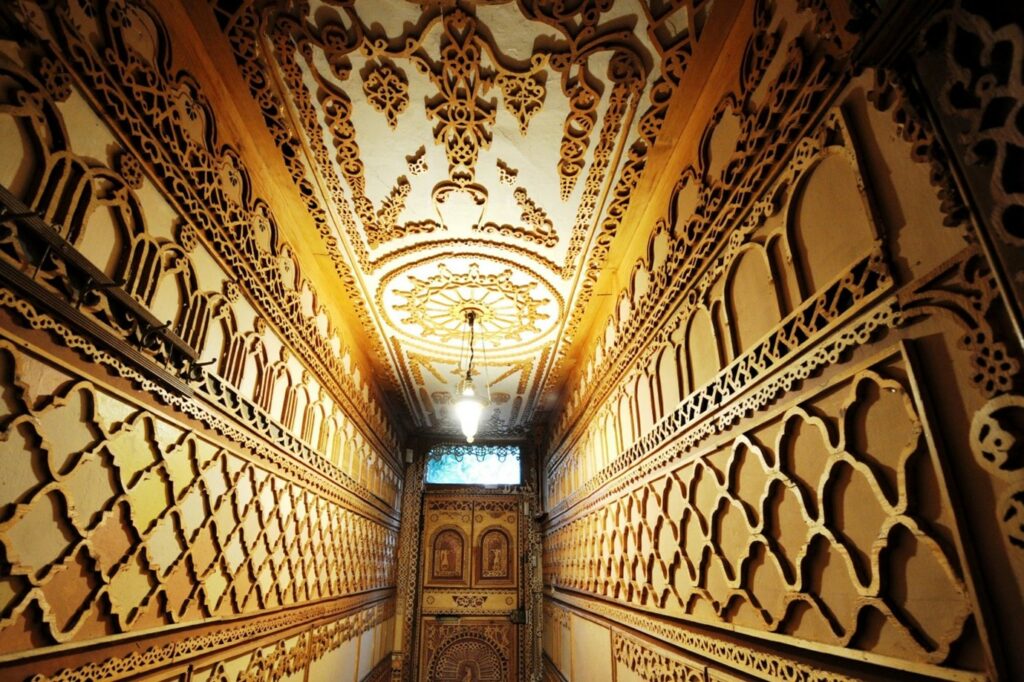
The image below is from National trust property, 575 Wandsworth Road, famed for its fretwork throughout the property. Compared by the tutors to the look of a book nook and the architectural detailing of the Brighton pavilion, it definitely has an exotic feel about it, which demonstrates attention and consideration but is it too much? The level of detail in such a confined space breaks at least three of Rams’ principles and proves the point that good design is is also about context and placement.
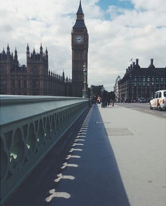
The next example is the infamous Westminster Bridge and shows how using a classic Victorian trefoil detail can have unusual consequences. When the sun hits the bridge at the right angle, an obvious shape is formed from the cast of the shadow. Whether this was an intentional amusement for the designer or a design flaw, it is now said that “Westminster Bridge was specially designed so that the shadows would accurately reflect the public’s opinion of the 650 members of the House of Commons”
If you wanted to know which bad design from the podcast really grinds Amy’s gears, here it is…
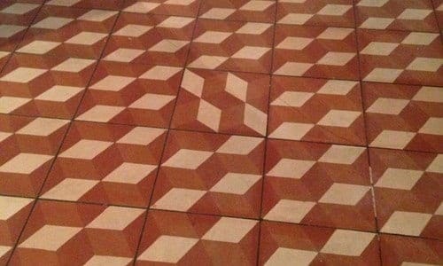
A patterned terracotta floor. Could this have been intentional? Perhaps there was some disagreement between designer, client and contractor as this design flaw seems motivated by vengeance? How long could you look at it without ripping it all up? Head over to Liabl.com to see more home design fails.
One of SJ’s pet-peeves right now is the over-use of metallic details –
“Coppers, brass, any metal details, are being over used. There are brass frames everywhere, the furniture has a brass frames, the floor lamp is brass, light fixtures are brass – it’s everywhere! Metal accents are often used to add highlights to dark interior schemes, however, there are more creative ways to add warmth to darker spaces, such as upholstery in a complimentary colour. Depending on the tone and hue of the paint, a patterned rug in a deeper warm tone which would not only add texture but the contrast that this interior desperately needs.
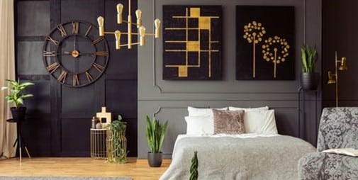
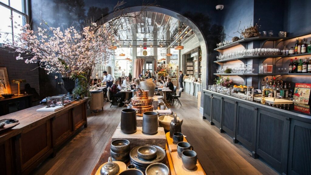
The image below is evidence that adding warmth via materials, furniture, artwork and accessories works far better than overusing one element.
The next few designs tickled our tutors on The Awkward Corner….
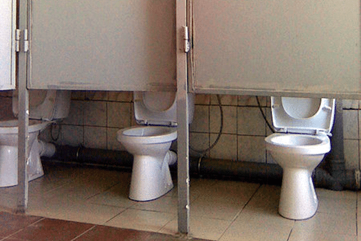
The next image was likened to the public toilets at St Pancras station – demonstrating that there has been no consideration to practicality and function, regardless of aesthetic.
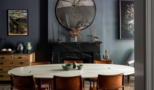
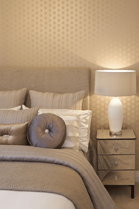
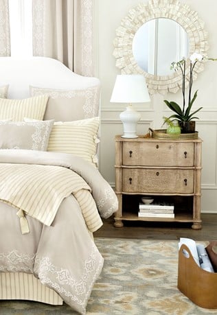
These two are great examples of bad and good design. Choosing a monochromatic colour scheme that is crisp and fresh can work really well if it is balanced with different tones and textures. The right image is inviting, interesting and cosy, the first just a bland beigefest with no real style.
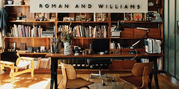
Can you get it right all the time in design? If you follow Rams’ ten commandments of good design, we think so! In our podcast, SJ talks about the work of Roman and Williams, a design studio known for their work on hotels, retail spaces and most recently, cultural projects. Their style is proof that layering a look with meaningful objects and materials is the key to success.
SJ says – “Their approach and ethos is about the story of a space and the objects that go into it. They do not focus on a definitive style from any era. They strip things down to their essence and instead of design, they strive for integrity and character, combining traditional materials and resources from the area where the building is located and known for their contradictions, use of layers and eclecticism. Devoted to rebelling against disposability and the common stereotypes of what it means to be modern today.”
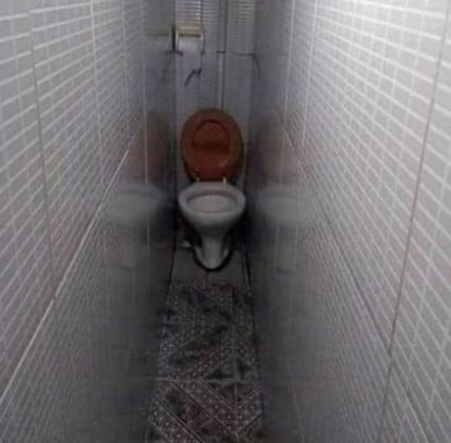
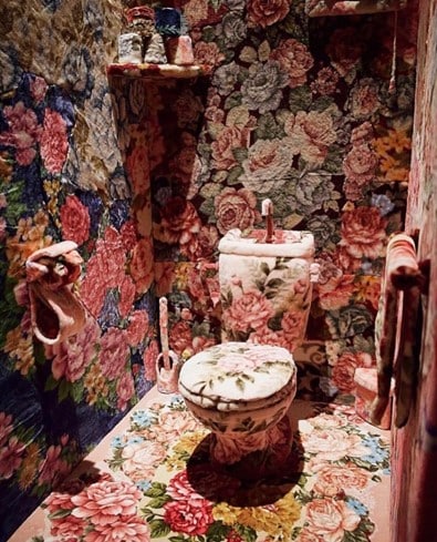
Carpet in a bathroom is a never a good idea but this design goes so far it’s funny!
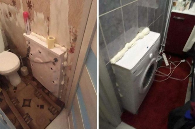
A washing machine in two rooms securred by expanding foam?. It may be a great example of bad design but using the other side of the washing machine as a shelf may be a stroke of genius!
Knowing the difference between good and bad design is a start and it’s not always as obvious as some of our examples. You can learn a lot by looking at your surroundings and asking yourself whether Dieter Rams’ ten principles apply. There are bound to be appliances, cookware, something in your car or home which drives you absolutely insane. Challenging the designs of others can help you to become a better designer by enhancing critical and reflective thinking skills. Recognising the failures of others can help you to understand what ‘good’ design really is and help you to create designs which are aesthetic, useful and fit for purpose.
UK students pay approximately 50% of the full course fee – the balance is funded by the UK Government’s Adult education budget (AEB).
The National Design Academy is the only design school to be able to offer this funding as our Diplomas are all fully accredited by AIM Qualifications.