Written by NDA tutor Amy Payler-Carpenter
Pentagram
Pentagram is a multi-disciplinary partnership, which encompasses graphic design, architecture, interior design, exhibition design and installations. What sets Pentagram apart from others in the field is it that they has 23 partners, all of which work directly with the clients.
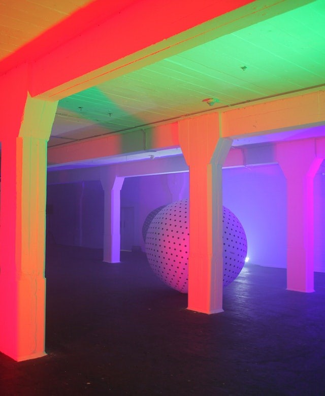 Synth Play at the We Are Robots Festival, the Truman Brewery
Synth Play was an installation developed by Pentagram in 2018 as part of the We Are Robots Festival. It used the movement of the inflatable shapes to change the soundtrack being played, which would in turn change the atmosphere of the space. The idea behind this was to allow the people visiting the festival to alter everything in their environment, from sound, to lighting, with the movement even effecting smell. The shell of the space did not change, but with the addition of the inflatables and mood altering lightings the space would become unrecognisable.
Overlooked
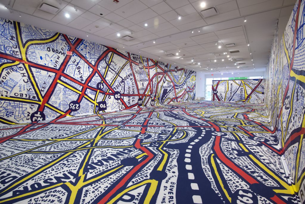
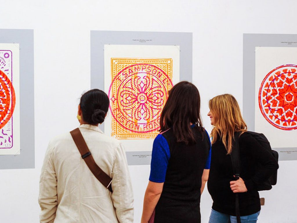
The firm pride themselves on their cultural considerations, this is literally demonstrated by the images above both of which are exhibits designed around the streets of two cities, Philadelphia and London. ‘Philadelphia Explained’ used hand painted maps of the city to covering the walls and floors of a space at the Tyler School of Arts, allowing the spectator to immerse themselves in the city’s streets. In ‘Overlooked’ Pentagram designed limited edition graphic posters, which celebrated London’s industrial past by exploring its manhole covers. The space used to showcase these posters could not be more opposed to that used for ‘Philadelphia Explained’, with white walls ensuring that the graphic prints stood out.
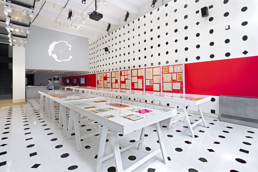
Pentagram pride themselves on collective and collaborative working; among the in-house team and with a wider community of designers. No project illustrates this better than ‘Century: 100 years of Type and Design’, which combined a range of artefacts from 12 different organisations, representing 630 different typefaces. The walls and floor were covered in 1058 dots, squares, rectangles and diamonds, with the artefacts being presented in cases organised to best illustrate the evolution of typeface. No space was left unaffected by the exhibition with lighting rigged up to illuminate the artefacts as the designers wished and the exhibition logo transferred onto the front window.
Caruso St John
Founded in 1990, Caruso St John, the architecture firm do not shy away from smaller exhibition projects. In fact, the partner’s deep interest of contemporary art and museums is cited as one of the main reasons for their work in this field. They see exhibition design as small scale architecture with the organisation of space being as important.
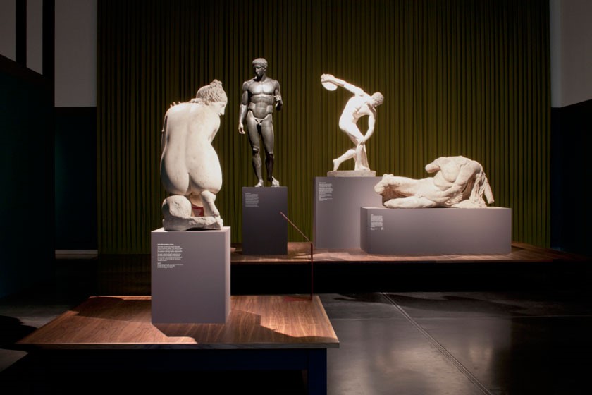
‘Defining Beauty’ is a prime example of less is more, however do not be fooled by the seemingly ‘lack’ of design here. Every part of the space has been carefully considered to ensure that the art work is seen in the best possible light. Each piece needed its own space so it could be appreciated fully, but these also needed to work within the context of the 10 themes focused on overall. The lighting was kept low so that the art work could be illuminated to catch the eye.
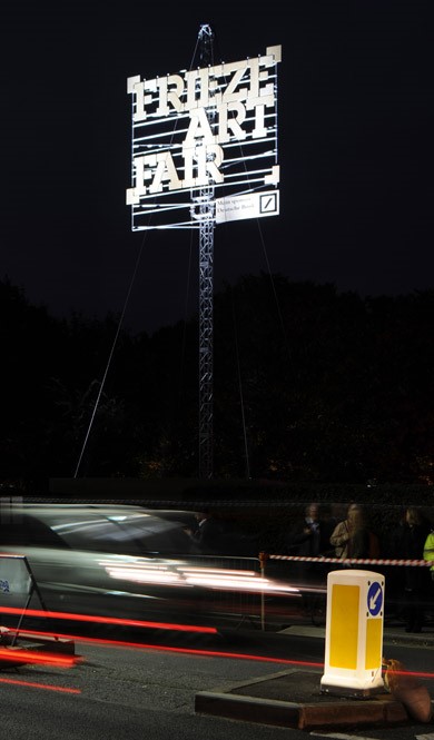
Caruso St John were responsible for the Frieze Art fair 3 years in a row. The tent which is erected in the same place each year in Regent’s Park needs to house a number of galleries, all exhibiting different elements from the world of art and design. The aim over the 3-year tenure was to maximise the height of the tent, which in turn would offer a better sense of orientation. A section of the tent also, overtime, became more transparent so that what was inside would become almost visible, enticing in the visitors. The benefit of working with the same space each year was that the design become more elaborate and impression, with the final entrance sign reaching 18 metres high in the final year.
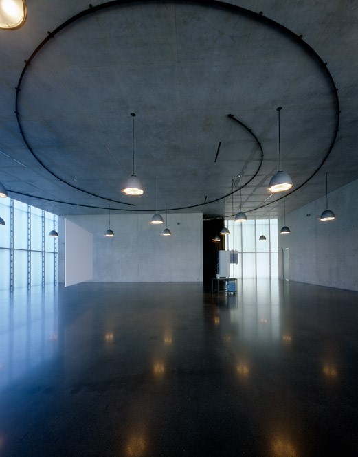
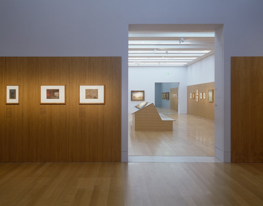
The Practice’s experience in architecture has a noticeable impact on the exhibition spaces worked on by the partners. The Kunsthaus Bregenz project was a collaboration with film maker Thomas Demand who needed absolute darkness to show his films. Caruso St John created a spiralled motorised track, fitted to the ceiling, on which a curtain would draw when needed. The spiral curtain juxtaposed the angular structure of the interior architecture, but mirrored the floor through the use of colour, ensuring the cohesion between the permanent and temporary. The installation of wood panelling at The Tate Britain’s ‘Turner and Venice’ exhibition in 2004 further illustrates how the existing interiors are used to create seamless interventions. Here the panelling was thought to be the best way to showcase the artwork, and matches the flooring. Furniture was then built to mirror the wood panelling and used to exhibit further works.
There are some key considerations when designing an exhibition space, as illustrated within the examples above. An exhibition should provide a visitor with an experience designed to enhance the subject being displayed, and this can be done with interventions and technology. When designing an exhibition space, you should consider all aspects, including lighting, materials and layout just as you would for any other interior design project. Working in collaboration with others is also important, as the artist, curator and owner will all have an opinion on how best to present work or ideas.


One Response
Thanks For the best post very useful information. Thank you for sharing this post and helpful content.