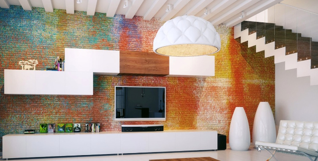
The New Year often calls for a change. If it is not a personal resolution of some sort, the house is the next in line for a ‘drastic change’. Choosing the right colour palette and scheme for a room can be a pleasurable and mind boggling task. What will work? Will it be bright enough? Is there enough character? Is it too much? Will I get bored of it? Well, here is a bit of inspiration to kick start the 2017 colour palette hunt.
Neutrals and nudes
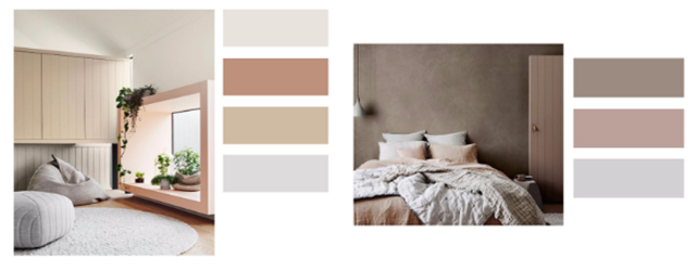
Neutrals and nudes are a harmonious scheme for a comforting and airy feel. Select a few colours with a slight tonal value. Check they are close but do not merge into one another when placed next to each other. Choose a base colour, this colour will cover a large proportion of the interior. The rest would be applied in smaller but significant proportions within the space. One item of furniture perhaps, a rug or bedding. Don’t forget the fixtures, doors and windows can have a little colour too.
Dulux, Santience: Living space and Bedroom
Triadic colour scheme
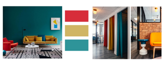
A triadic colour scheme is where each colour for the scheme is positioned on the colour wheel at equal distances apart. When connected these three points form a triangle, hence the term ‘triadic’. This colour palette is a slight variant of this. Red, yellow and blue being the primary colours is a triadic scheme. The ‘blue’ here is more of a deep teal; the red and the yellow are richer deeper versions of its primary origins. This colour scheme set alongside black and white, frames this palette with striking results.
Dulux Antidote Colour Cure Trends 2017: Chroma, a graphic view. Kwerk Co-working space and gallery, Paris.
Rich Tone
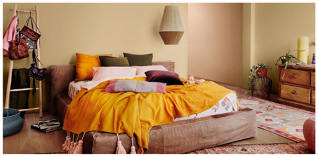
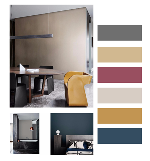
Tone within colour palettes and schemes have featured as a co-star in many interiors projects over recent times. Creating understated luxury according to Dulux (2016). These colour combinations are grounded in greys or a biscuit hue then accented with a deep rich variant of the classic contrasting colours. Muted yellows, plums and blue’s. Touched by pinch of brilliant white, exposed wood or metallic finishes creates a refined, inviting and confident colour palette. These examples show a playful warmer bedroom and a more formal example of this colour palette.
Dulux Antidote Colour Cure Trends 2017: Entwine, a colourful weave: Bedroom
Dulux Antidote Colour Cure Trends 2017: Construct, meeting room, bathroom and bedroom
Refreshing formal
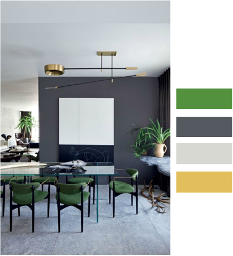
Introduce a bit of greenery (Pantone pun intended). Your interior will thank you. An accent of this colour refreshes, invigorates and adds a pleasant dose of visual interest. Adding a metallic flash of copper adds subtle sophistication.
Osvaldo Tenorio Home
Proportions
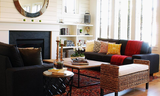
Finally, the proportion of colours used can make or break an interior. As a general guide try this tip, captured by HGTV, better explained by Interior Designer McCauley 2016. “When decorating a space, divide the colors into components of 60 percent of a dominant color (walls), 30 percent of a secondary color (upholstery) and 10 percent of an accent color (accessories),” advises desginer Mark McCauley. “Works every time!” he says. “This ratio ensures that the colors are properly balanced and there’s just enough pop for interest.”
Colour Palette Tricks. Photograph by Judith Balis
References
Dulux, (2016) Antidote, A Colour Cure Trends. Dulux, Santience: Living space and Bedroom [online image] Available from:https://issuu.com/duluxaustralia/docs/andrea_colour_forecast_2017_consume_2533ec3977e0a2 [Accessed 20.12.16]
Dulux, (2016) Antidote, A Colour Cure Trends. Dulux, Chroma: A Graphic View [online image] Available from:https://issuu.com/duluxaustralia/docs/andrea_colour_forecast_2017_consume_2533ec3977e0a2 [Accessed 20.12.16]
Wallpaper (2016) Finest Design Led Co-Working Offices. Kwerk Co- working space and gallery. [online image] Available from: http://www.wallpaper.com/gallery/architecture/finest-design-led-co-working-offices-in-the-world#170260 [Accessed 20.12.16]
Dulux, (2016) Antidote, A Colour Cure Trends. Dulux, Entwine A colourful weave,Bedroom [online image] Available from:https://issuu.com/duluxaustralia/docs/andrea_colour_forecast_2017_consume_2533ec3977e0a2 [Accessed 20.12.16]
Dulux, (2016) Antidote, A Colour Cure Trends. Dulux, Construct, meeting room, bathroom and bedroom [online image] Available from:https://issuu.com/duluxaustralia/docs/andrea_colour_forecast_2017_consume_2533ec3977e0a2 [Accessed 20.12.16]
Mad about the House, (2016) Osvaldo Tenorio House [online image] Available from: http://www.madaboutthehouse.com/10-beautiful-rooms-31/ [Accessed: 20.12.16]
HGTV (2016) 15 Designer Tricks for picking a perfect Colour Palette. [online image] Available from: http://www.hgtv.com/design/decorating/color/how-to-choose-a-color-scheme-pictures [Accessed 20.12.16]
One Response
For a young family in 2017, I’d recommend going with a triadic colour scheme. It will look more contemporary than rich tone or neutrals based interior and you’re much less likely to get bored with it.