Think of colour as your secret design weapon.
Colour is one of the most powerful design tools at your disposal. It sets the tone of a room before a single piece of furniture is in place. It can energise, calm, inspire, and even make a small space feel bigger or a large space feel cosier. Yet, despite its impact, colour is often one of the trickiest elements to get right.
If you’ve ever stood in front of a paint display feeling overwhelmed by a thousand similar-looking shades, you’re not alone. Choosing colours isn’t just about picking your favourites. It’s about understanding how colour behaves in different light, how it interacts with other tones, and how it makes people feel.
One of the first modules we teach on the Professional Interior Design Diploma is ‘Colour for Interior Design’. You’ll explore the historical context of colour, colour psychology, and how to choose schemes that balance or enhance the other elements of your design. It’s not just theory; it’s a practical skill you’ll use in every project going forward.
Whether you’re refreshing a tired living room, designing a calming bedroom retreat, or planning a full home makeover, learning how to use colour effectively is essential. From the basics of the colour wheel to the emotional impact of different shades, this guide walks you through the key principles of colour in interior design. You’ll also find practical tips for creating balanced, beautiful spaces that reflect your style and support the way you live.
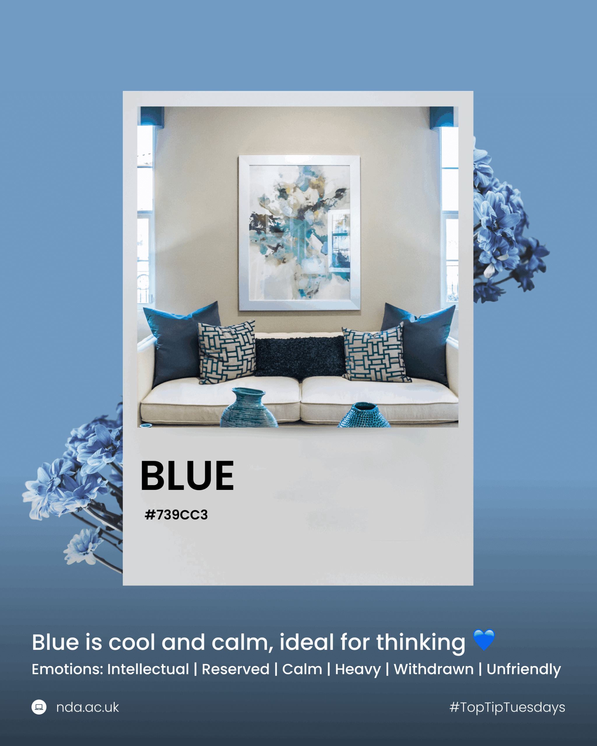
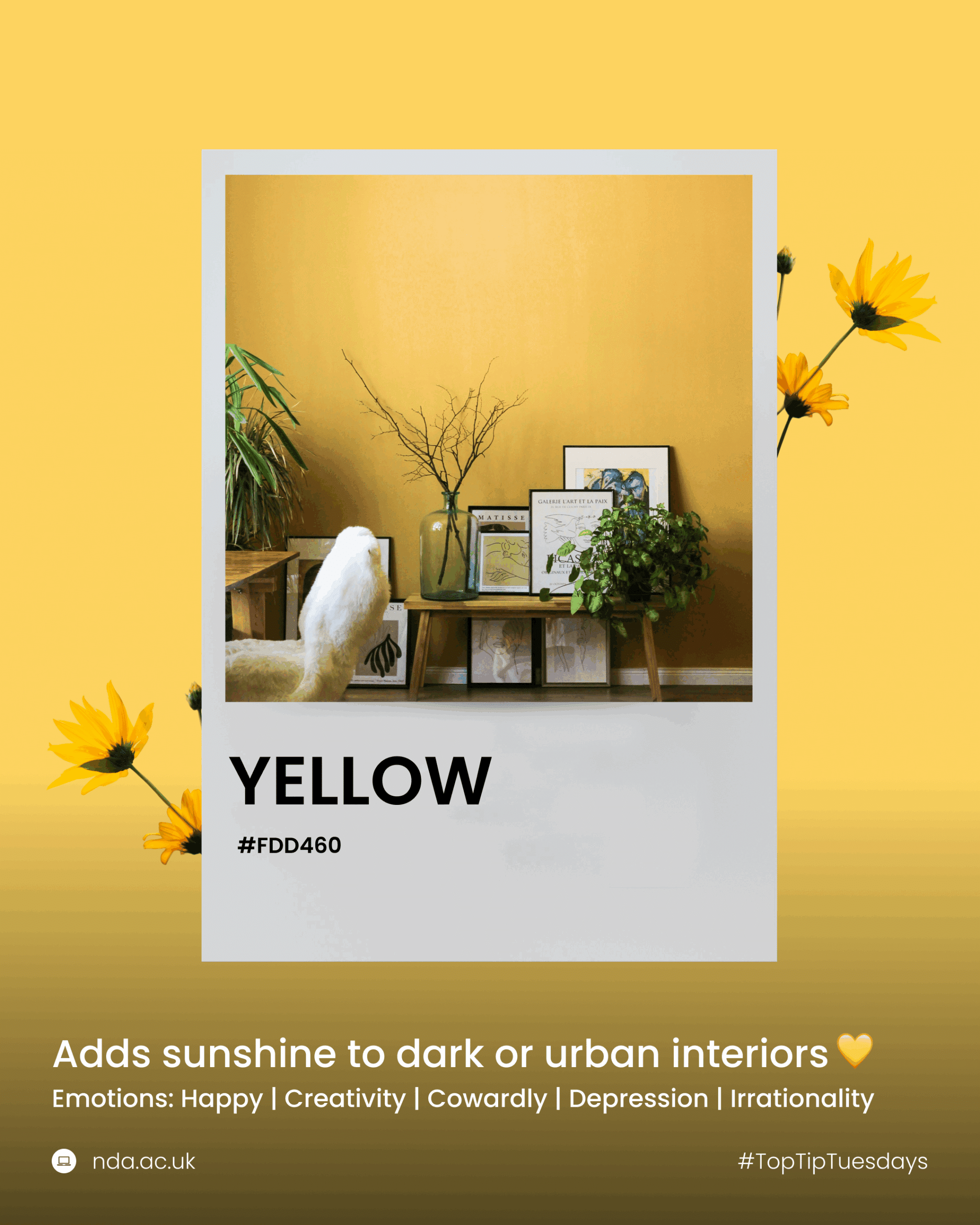
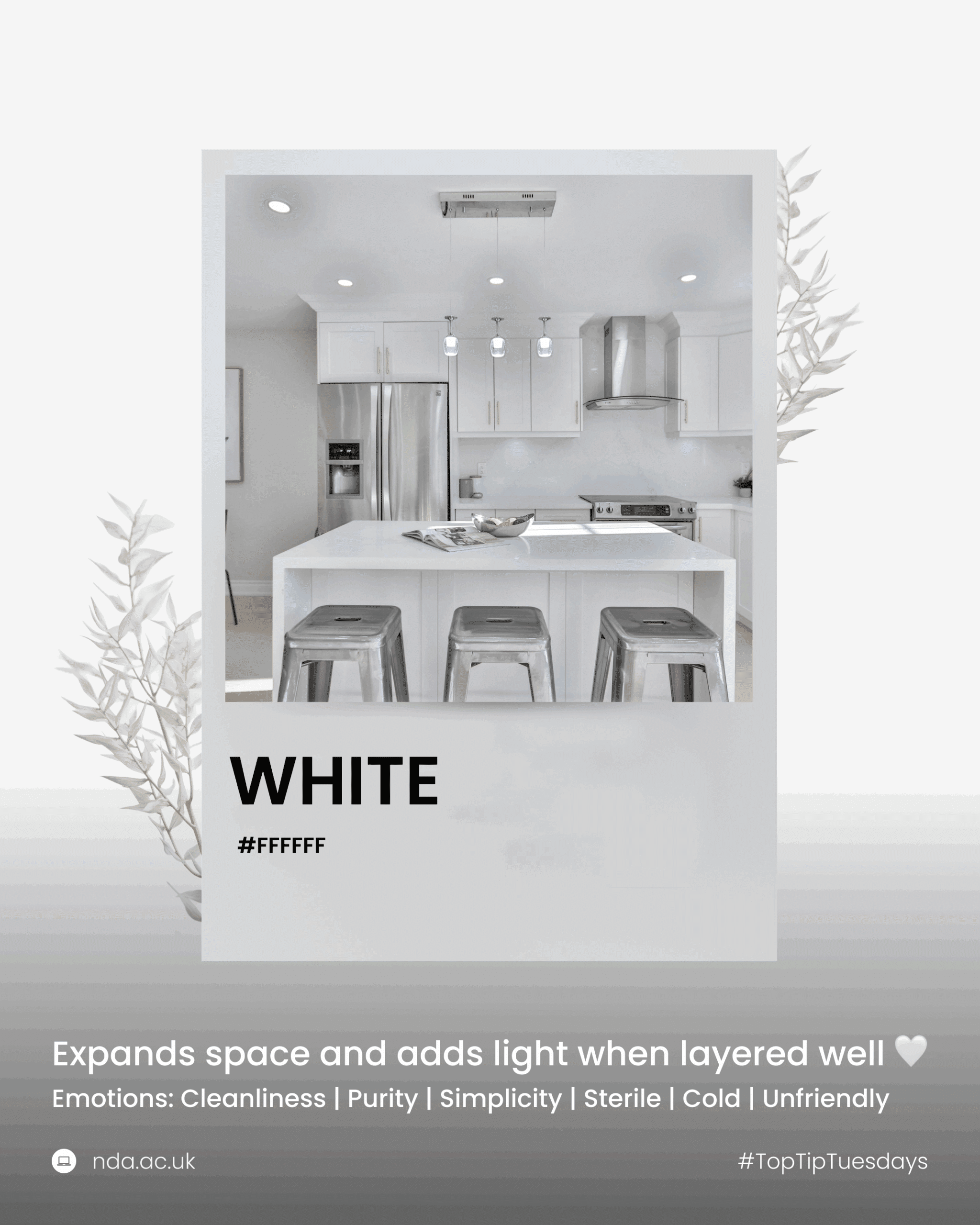
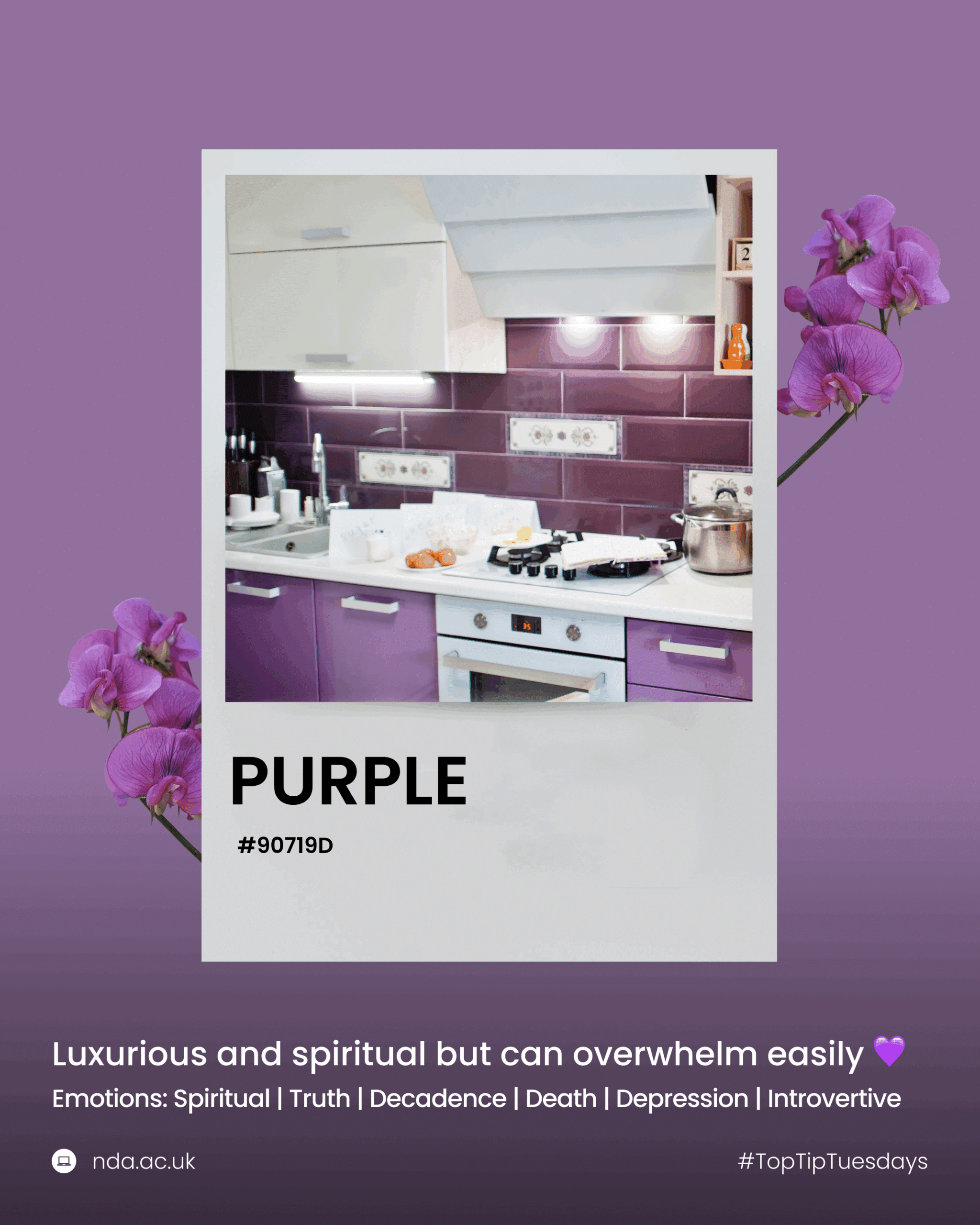
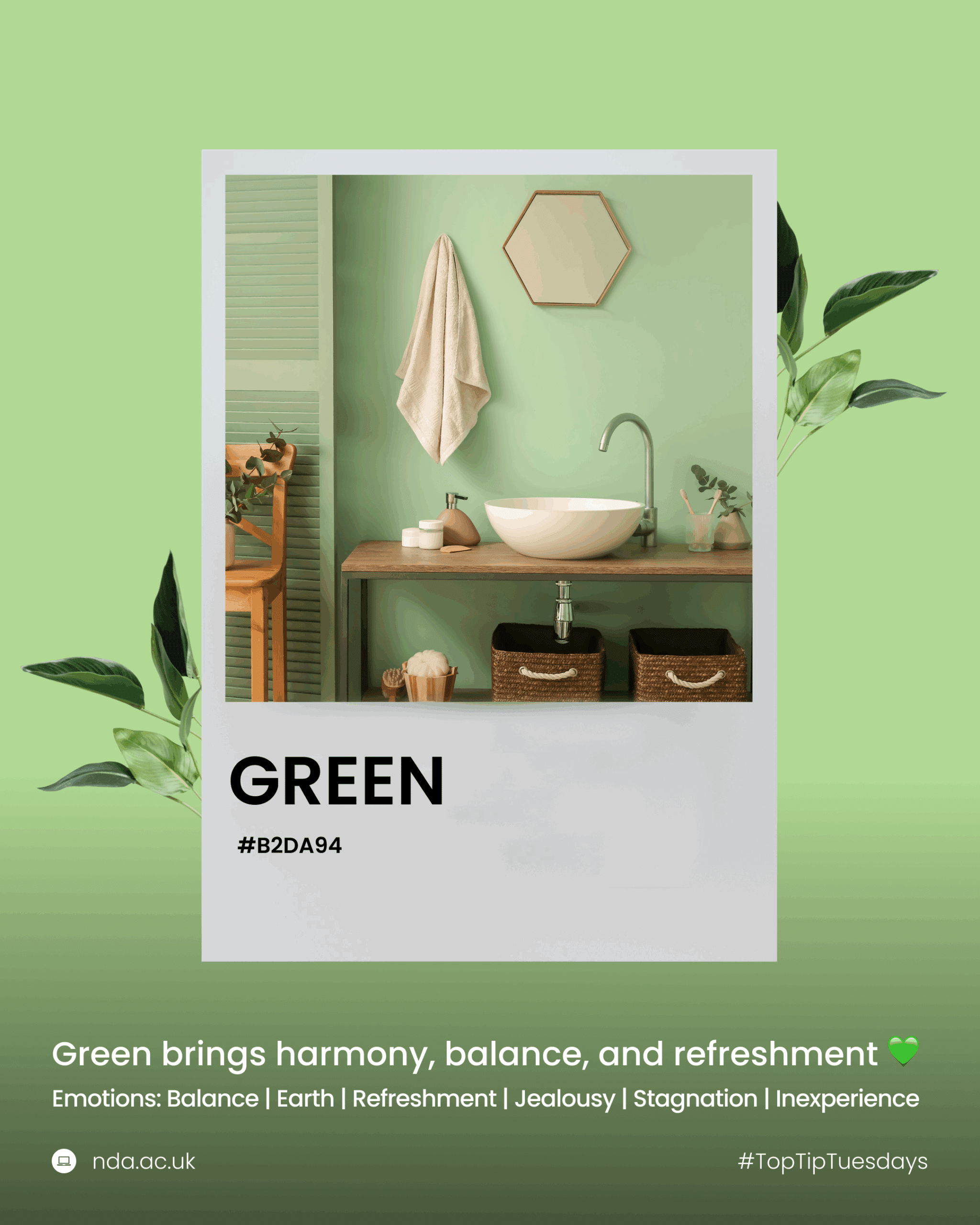
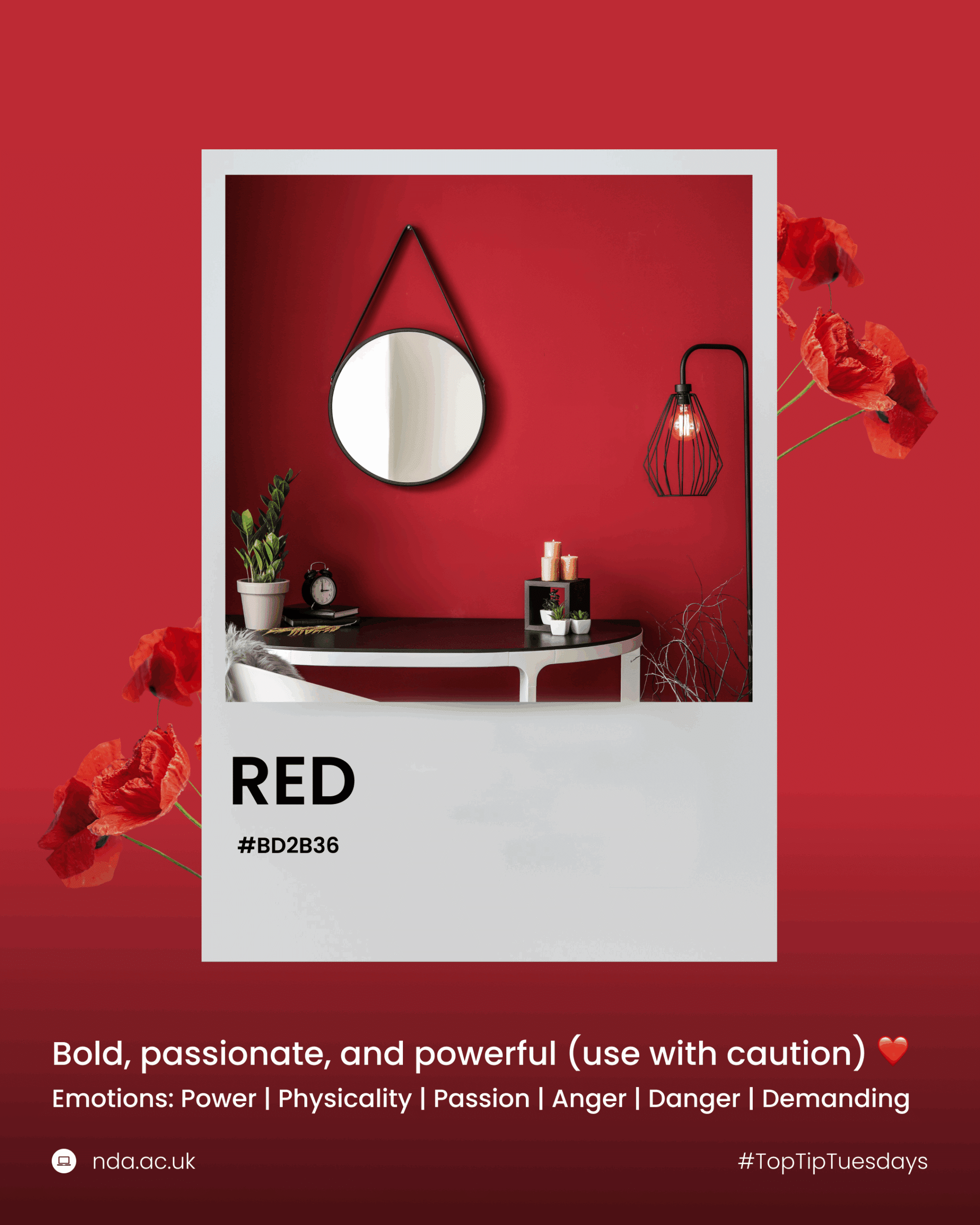
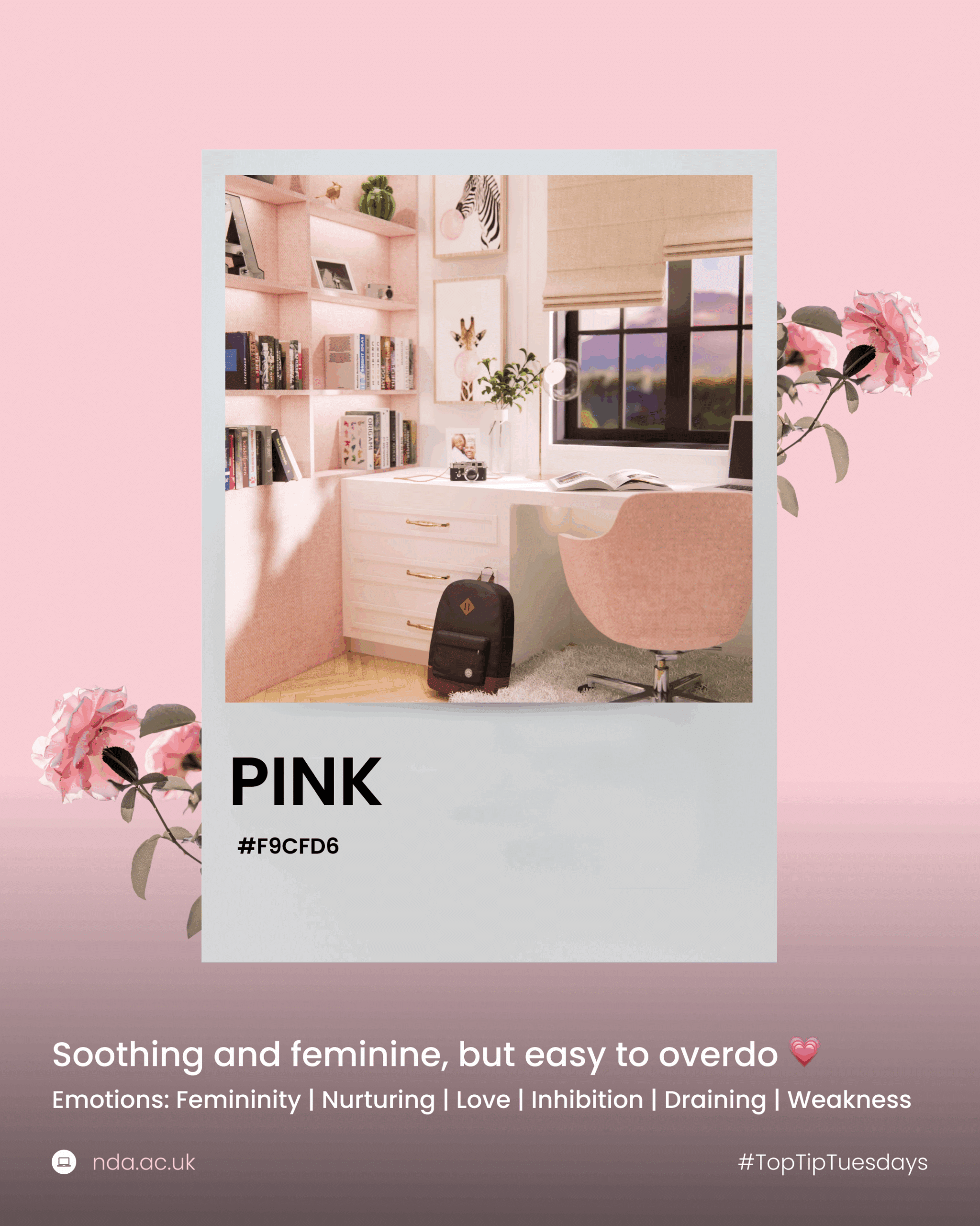
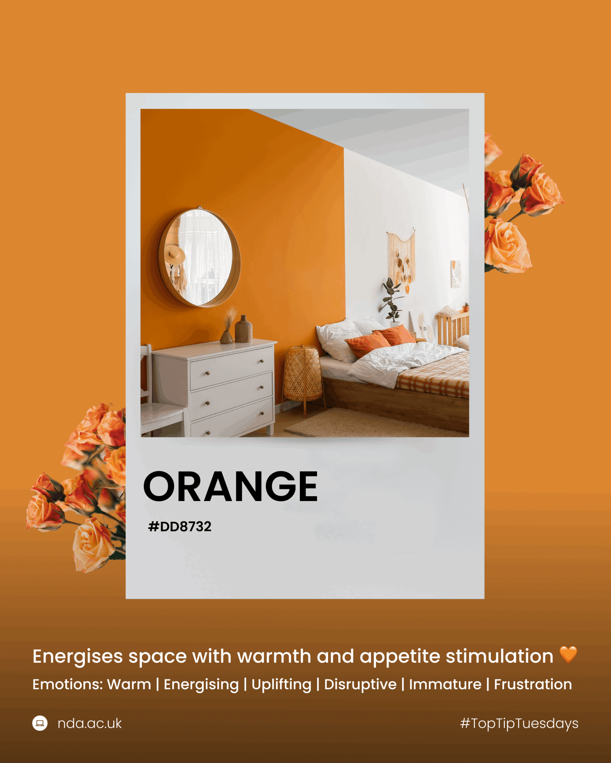
Before diving into colour selection, it’s essential to grasp the basics of colour psychology. Different colours can evoke specific emotions and set the tone for a room. Here’s a quick overview of what various colours typically represent, based on recent research 👇
When starting a design project, consider the purpose of the room and the feelings you want to evoke. For instance:
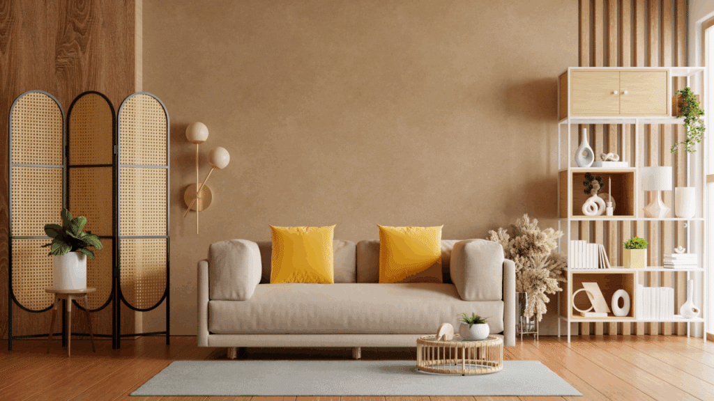
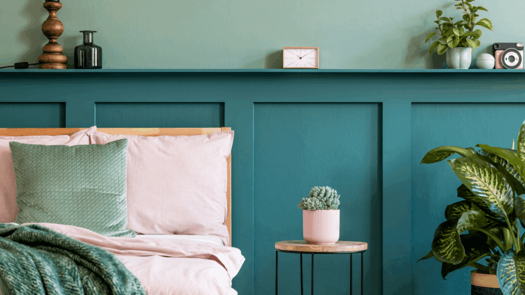
Don’t be afraid to experiment with bold colours. While neutral palettes are safe, they can sometimes lack personality. Introduce colour through various elements such as:
Starting with smaller items allows you to test colours without committing to a full room makeover.
Accent colours can add depth and interest to a space. Choose one or two accent colours that complement your main colour scheme. For example, if your room is primarily neutral, a pop of vibrant colour can create a focal point and add visual interest.
Based on colour psychology, select accent colours that enhance the room’s purpose:
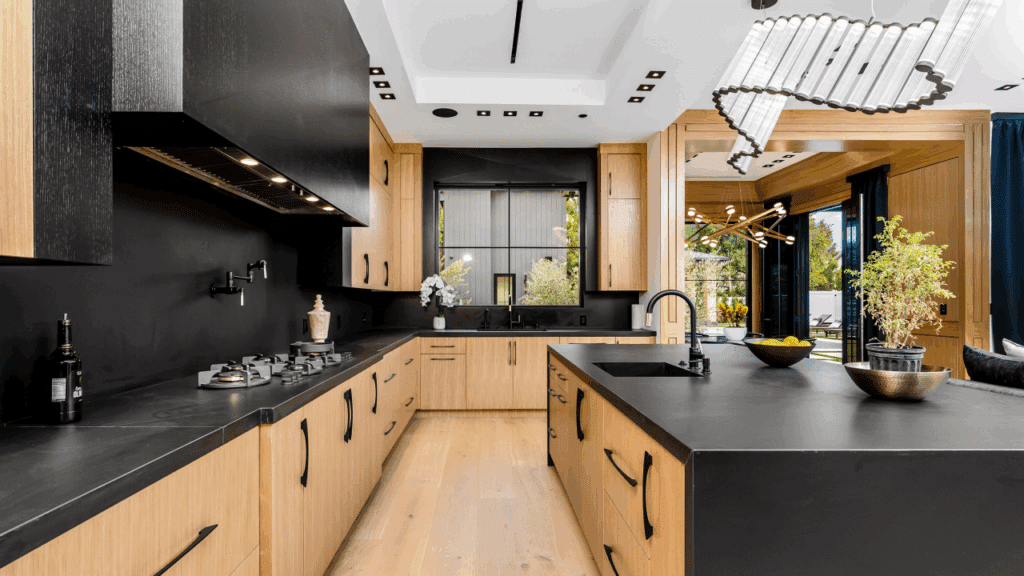
Colour isn’t limited to paint and fabrics; materials like wood, metal, and stone also contribute to the colour palette. For instance:
Consider how these materials interact with your chosen colours to create a cohesive look.
To keep your design cohesive and visually calm, we often recommend limiting your colour palette to three key shades: a dominant colour, a secondary colour, and an accent. For those unsure of how to build a colour scheme, a helpful guideline we introduce in our Professional Interior Design course is the 60-30-10 rule.
For example:
It’s not a strict rule, but it’s a great place to start if you’re aiming for balance and harmony throughout a space!
As we conclude;
Mastering colour in interior design takes practice, but by understanding the basics of colour psychology and following these practical tips, you can create spaces that are both beautiful and functional. Remember to trust your instincts and have fun with the process!
UK students pay approximately 50% of the full course fee – the balance is funded by the UK Government’s Adult education budget (AEB).
The National Design Academy is the only design school to be able to offer this funding as our Diplomas are all fully accredited by AIM Qualifications.